A cardiac care destination

Image courtesy of Wayne Johnson, Main Street Studio
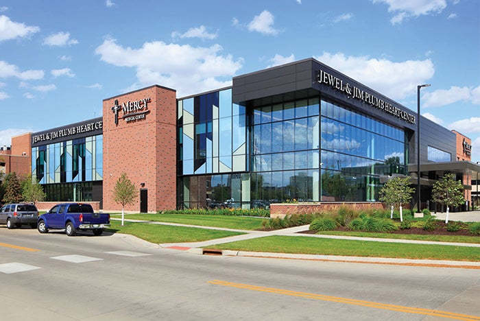
With the goal of becoming the heart center of choice in eastern Iowa, Mercy Medical Center expanded its cardiovascular services with the Jewel & Jim Plumb Heart Center adjacent to its downtown Cedar Rapids hospital. This 72,000-square-foot, high-tech facility offers lifesaving and preventive care services across the continuum of cardiovascular care, including education, prevention, screening, diagnosis, treatment and rehabilitation.
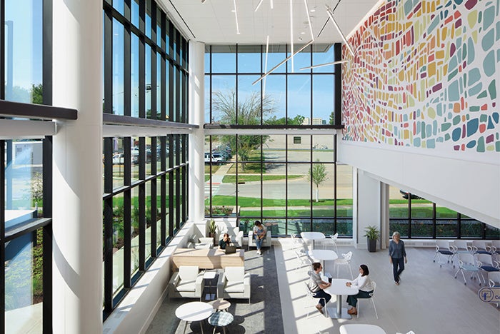
Designed and constructed by Ryan Companies’ integrated design-build team, the new Jewel & Jim Plumb Heart Center includes two stories of cardiac clinic, imaging and rehabilitation spaces. The center’s ground floor features a two-story lobby; rehab and physical therapy space with exercise equipment; an indoor exercise track that extends outside; an imaging suite for MRIs, CTs and nuclear medicine; a flexible conference and education room; a cafe; and a non-denominational peace room. Connected to the main hospital via a 280-foot skybridge, level one features 72 exam rooms, a pediatrics area and staff collaboration and support spaces.
To identify opportunities for increased efficiency, ease of access and patient convenience, the design team shadowed Mercy’s clinical teams and met with physicians and stakeholders to observe the existing flow of patients, staff and materials. The design team presented three work pod layout options to the clinical staff to determine the most suitable layout for the clinical workflow. The options minimized exam rooms along the exterior walls and reorganized staff collaboration zones by creating staff spaces that encourage more streamlined collaboration between physicians, nurses and the rest of the care team.

Image courtesy of Wayne Johnson, Main Street Studio
The final design produced an efficient layout that maximizes views of the building’s unique exterior facade and provides robust natural light to staff and patient spaces. In addition to clinical space, the team reenvisioned standard waiting space by reducing square-footage allocations, implementing subwait zones and recommending staggered appointment times.
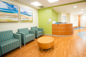
The design team sought to create a facility that is approachable and easy to navigate for a multigenerational patient population, employing dementia-friendly environmental cues and strategies to support those with memory loss through memorable features, appropriate visual contrast and product selections for acoustics and ease of movement. Distinct large-scale graphics distinguish critical decision-making points, and entrances and exits are reinforced with large-scale signage and color variation to create straightforward navigation and sense of place for patients and guests. Flooring patterns are simple, use rubber and linoleum where possible and emphasize a color palette that provides contrast between floor and wall planes.
This new, state-of-the-art facility helps bring Mercy’s vision of uniting its outpatient cardiac care services under one roof.
WANT TO BE FEATURED? Visit the American Society for Health Care Engineering's Architecture for Health Showcase to learn more about participating.


