Sailing into the future
Project specs
Project Jersey Shore University Medical Center
Location Neptune, N.J.
Total floor area 433,400 square feet
Number of floors 3
Number of beds 108
Construction cost $238 million
Project cost $300 million
Groundbreaking May 2006
Opening date July 2009
Team Members
Owner Meridian Health
Architect and Interior Designer WHR Architects
General Contractor L.F. Driscoll Co.
MEP Engineering PWI Engineering
Civil Engineering Dewberry-Goodkind Inc.
Structural Engineering Birdsall Services Group
Medical Equipment Planning Genesis Planning
Landscaping Melillo + Bauer Associates
LEED and Sustainability Consulting The Sheward Partnership
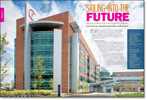
The renovation and expansion of Jersey Shore University Medical Center (JSUMC), Neptune, N.J., is intended to transform patient care at the facility and help set the hospital's future course.
Thus far, it's a sound one. The 433,400-square-foot, $300 million, Leadership in Energy and Environmental Design (LEED) Gold-certified facility opened July 2009, nearly $4 million under budget and six months ahead of schedule.
Design inspiration
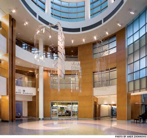
Early in the design process, while watching the wind fill sails to guide boats along the local shoreline, the project's lead designer recognized a powerful symbol for the health care facility. Tushar Gupta, AIA, NCARB, principal, WHR Architects, Houston, says the metaphor of a sail impacted the evolution of the building's architecture. A sail is represented in the swirling, stylized design of the hospital atrium.
The medical center's exterior palette of brick and metal panels integrates the building with existing campus structures, while the atrium provides a new, forward-thinking aesthetic. The coastal imagery continues in the main lobby and adjacent public concourse, with ceiling material evocative of wood planking; flooring that subtly represents sand, shore and water; and retail space aligned along one side of the concourse to suggest a boardwalk atmosphere.
The entire building's interior design takes its themes from the area's four major natural elements—the shore, the water, the garden and the sky. "We tried to find materials that replicated textures and elements that you would find within each theme," says Sherri Shafiei, IIDA, associate and interior designer, WHR. Textured wall panels were installed to indicate aspects of each of these elements, such as the horizontal sky, falling water, moving sand and growing plants. Gail Sterling, FIIDA, AAHID, principal and senior designer, WHR, says the panels helped give different spaces interest and identity without exceeding the project's art budget.

Nursing neighborhoods
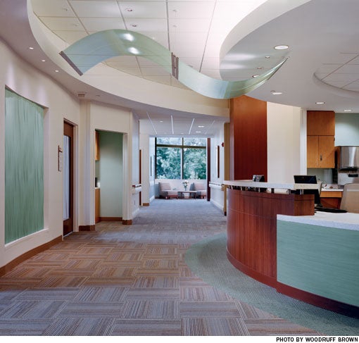
On each patient floor, a large picture of a different local scene is installed at the elevator lobby, providing a memorable wayfinding aid. Floor-to-ceiling windows at the end of each corridor also lend visual cues for locating oneself in the building, as well as natural light to enhance the fresh feel of the interior color palette, which is based on soft white and sand tones. Raised ceilings and indirect lighting at the nurses' stations break up the length of each corridor.
The patient units were developed with regard for the needs of aging nurses and patients. As the baby boomer generation ages, "The acuity level … is going higher and higher," says Gupta. "So while we're designing a medical-surgical unit, we're almost leaning toward attributes of a step-down or critical care unit."
There are 36 beds on each floor, divided into three groups, or neighborhoods, of 12. Four of the 12 rooms in each neighborhood were designed for higher acuity patients. Each neighborhood is supported by a hybrid nurses' station system that includes a central nurses' station and four decentralized charting areas, two on each side. The central station gives nurses space for collaboration, communication and social interactions, while the charting areas enable them to work close to patient bedsides.
To minimize walking distances, each neighborhood has its own supply space, medication station and staff break area.
The rooms were built with a nested toilet configuration, with the patient bathrooms located next to one another between every two rooms. This design gives nurses at the central station clear sight lines into eight of the 12 rooms in a neighborhood, through windows built into the patient room doors.
The nested toilet layout also allowed for the inclusion of wall-to-wall windows in the patient rooms. This creates a more soothing environment for patients and their families. Staff also benefit from the natural light that filters into the unit from the patient rooms, through the glass in the patient room doors.
The neighborhoods are differentiated in the interior design with aqua, green and blue accent colors related to the themes of the water, garden and sky, respectively.
Tested design
The corridors of the patient units are carpeted to help control noise. Caregivers tested the carpet—and the rest of the units' interior design—in an existing unit at JSUMC. On the test unit, doctors and nurses expressed a preference for clear glass in the patient room doors, for better visibility than the textured glass used in the original design. Because the clear glass did not bother patients, the design was changed accordingly.

Construction mock-ups also yielded important design information. The location of the hand-washing sink in the patient room was based on research indicating hand-washing compliance increases when the sink is placed in the path of the caregiver; this design was tested and approved by JSUMC staff in the mocked-up patient room.
As a member of the Center for Health Design's Pebble Project, JSUMC will continue to test and report aspects of the design, such as the effects of decentralization in the
nursing neighborhood on interdisciplinary communication patterns, quality of care and patient safety.
Just before the new hospital opened, 100 departmental managers and hospital administrators, including JSUMC president Steve Littleson, spent the night in patient rooms to evaluate the design from a patient's perspective. The next morning, Littleson says, "My overall thought was we deserved to feel really good about what we did."
Patients seem to agree. JSUMC admission volume is up 8 percent this year. The building "has changed the complexion of our campus completely," says Littleson.
Amy Eagle is a Homewood, Ill.-based freelance writer and a regular contributor to Health Facilities Management.
| Sidebar - Project captures the gold |
| The expansion project at Jersey Shore University Medical Center (JSUMC) was awarded Leadership in Energy and Environmental Design (LEED) Gold certification under the U.S. Green Building Council's LEED for New Construction v2.2 rating system. The hospital is the first health care facility in New Jersey—and one of few such facilities in the nation over 300,000 square feet—to receive this distinction. Several of the design initiatives that contributed to the LEED designation were implemented to create a more healthful building environment. These include the use of urea-formaldehyde-free composite wood and 100 percent outside air throughout the hospital. Other design features create building efficiencies. JSUMC received about $1 million in grant funding for two cogeneration units that use waste heat to generate energy. Michael W. Pavelsky, AIA, LEED AP BD+C, sustainability director for The Sheward Partnership, the project's Philadelphia-based LEED and sustainability consultant, says the payback for these units, not including the grant funding, is estimated at four to five years, based on energy efficiency and assumed energy costs. The project originally called for only one unit, but the hospital doubled the number installed once the short payback period was calculated. The facility is positioned to reduce solar heat gain and uses a high-performing building envelope. Tushar Gupta, AIA, NCARB, principal and lead project designer, WHR Architects, Houston, says the building design is 32 percent more efficient than the standard set by the American Society of Heating, Refrigerating and Air-Conditioning Engineers (ASHRAE 90.1). Features like sink faucet aerators and low-flow showerheads and urinals are projected to lower potable water usage at the facility by 30 percent. The project's 975-car parking garage significantly reduced the amount of surface parking required by the hospital. Pavelsky says this, coupled with the amount of green space squeezed onto the fairly tight site, lowers the building's heat island effect and overall cooling load. |
| Sidebar - Design helps access to care |
| Before its recent expansion and renovation project, Jersey Shore University Medical Center (JSUMC) suffered from many problems common to hospitals whose facilities have not kept up with expanded programming: limited parking, difficult navigation, long wait times and poor support services. "From the minute somebody pulled onto our campus they experienced barriers to access," says Steve Littleson, president, JSUMC. One of the main goals of the design and construction project was to improve access "all around from start to finish," he says. The new design accomplishes this in a number of ways. A loop road now circumvents the university campus, making it easy for people to drive to the hospital. A new parking garage connects directly into the hospital atrium on the garage's second level, which is reserved for patient and visitor parking. The project also included the construction of a new pedestrian loop on campus. A comprehensive signage system directs people to their destinations inside and outside the hospital building. The building itself was designed to be easy to navigate, with exterior views, artwork and color schemes that provide visual interest and wayfinding cues. The emergency department (ED) has its own two-story lobby and waiting area with a view to an exterior healing garden, which makes it just as welcoming and easy to identify as the hospital's main entrance and lobby. At 50,000 square feet in size, the ED is designed to handle 100,000 patient visits a year efficiently. The facility expansion also added 108 new private patient rooms to the hospital. As a result of these design measures, "there is virtually no wait to see a doctor; there's no wait for a bed," according to Littleson. "It's much easier to get in, much easier to get care, and the whole process of supporting that care is faster and more efficient." |
| Sidebar - SPEC SHEET |
| Principal Design Materials Carpet: Mohawk Group Carpet tile: InterfaceFLOR Ceiling: Armstrong World Industries Inc., Decoustics, Hunter Douglas and Lindner USA Inc. Curtain wall framing: National Glass & Metal Co. Door hardware: Hager Companies (hinges), Stanley Security Solutions Inc. (locksets) and Sargent Manufacturing Co. (closers) Doors: Algoma Hardwoods Inc. (wood) and Curries (hollow metal) Flooring: Polyflor (sheet vinyl and resilient tile) and Mannington Mills Inc. (sheet vinyl and vinyl composition tile) Glass: 3form Inc., National Glass (back-painted glass) and Oldcastle BuildingEnvelope (atrium frosted glass) Lighting: Acuity Brands Lighting (indirect wall and pendant), Cooper Lighting (specialty atrium), Eureka (sconces), Focal Point (2x4 recessed indirect) and Kurt Versen (downlights) Paint: Master Coating Technologies and Sherwin Williams Co. Plumbing accessories: American Specialties Inc. Plumbing fixtures: Speakman Co., T&S Brass & Bronze Works Inc. and Toto USA Inc. Roofing: Carlisle Companies Inc. (EPDM) and Sika Sarnafil (thermoplastic) Signage: AGS (exterior) and Takeform Architectural Graphics (interior) Tile: Bisazza North America Inc. (glass mosaic), Daltile (porcelain, ceramic, glass mosaic) and Villi USA (glass mosaic) Window treatments: Hunter Douglas Principal Furnishings Cafeteria seating: Source International Corp. Cafeteria tables: izzy+ Lounge seating: Bernhardt Furniture Co. and HBF Office desks and seating, files, shelving and conference tables: Allsteel Inc. Patient beds: Stryker Patient room seating: KI (sleeper sofa and recliner) and Nurture by Steelcase (recliner) Woodworking: Monarch Industries Inc. Major medical equipment Digital radiographic system: GE Healthcare Biplane neurovascular X-ray system and computed tomography scanner (64-slice): Philips Healthcare Mobile stretchers: Stryker Bariatric lifts: Getinge Group Infrastructure Boilers: Cleaver-Brooks Inc. Building management system and security: Siemens Corp. Chillers: York by Johnson Controls Elevators: ThyssenKrupp Generator: Caterpillar |


