Positive growth

Project Overview
Project Name Franklin Square Hospital Center Expansion
Location Baltimore
Total floor area (in square feet) 378,875 (341,225 for patient tower; 25,390 for central energy plant; and 12,260 for renovated space)
Number of floors 8
Number of beds 291
Project cost $175 million
Construction cost $137 million
Groundbreaking October 2007
Opening November 2010
Project Team
Owner MedStar Health
Architect Wilmot Sanz Inc.
General Contractor Bovis Lend Lease
Project Manager Lillibridge Healthcare Inc.
Environmental Consultion and Landscaping Dewberry
Interior Design Wilmot Sanz Inc.
MEP Engineering Leach Wallace Associates Inc.
Structural Engineering Rathgeber/Gross Associates
Medical Equipment Planning Medequip International
A hospital's image is fundamentally based on the care it provides to patients, says Adrienne Kirby, FACHE, president of Franklin Square Hospital Center in Baltimore. The facility is an extremely important component of that, she adds.
To prove the point, Franklin Square Hospital Center's recent addition is enabling the hospital to improve care in several ways.
The new patient tower provides space for an increased number of critical care and telemetry beds and for private rooms with family accommodations. The new emergency department (ED) is large enough to treat a growing volume of patients and the physical plant provides enough power to adopt the latest technology for patient safety.
First impression
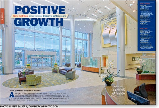
Every aspect of the hospital addition was designed to serve patients and their families better, including the new lobby. "A big part of what we were trying to do was create a new sense of entry," says Curt Mugge, AIA, project manager for architecture firm Wilmot Sanz Inc., Gaithersburg, Md. "Everybody can see that this is the entry. It was hard to find before."
A meditation garden with benches and trellises welcomes patients and visitors to the front entrance. The glass canopy and front door are designed to draw people into the facility. Fans and intake louvers were carefully sited to meet fire codes for smoke evacuation without interfering with the transparency of the lobby.
"It's very spacious, very inviting," says Dennis Kephart, senior director of facilities at the hospital center.
The entire lobby spans three floors, from a lower-level lobby off the ED to a second-floor elevator lobby that overlooks the main space. Bamboo plants, approximately 20 feet tall, reach up from the lower level, providing greenery and life in the space. Sheets of stainless steel curve toward the ceiling along an upper wall, transforming into sculptural birds that soar across the top of the lobby.

Seating areas, water features, a fireplace, café, gift shop and chapel provide a number of ways to make people feel comfortable in the hospital. "It makes a nice impression when you come in," comments Stephanie Glusman, interior designer at Wilmot Sanz.
The lobby also serves as an event space for hospital galas, and it even has been requested as the site for a wedding.
Efficient emergency care
The new ED can handle 150,000 visits a year. According to the hospital, it is the busiest ED in Maryland.
The hospital's previous ED was built to accommodate 60,000 patient visits a year, but was receiving about 105,000 visits a year by the time the expansion project was completed, says Kirby. "You can just imagine what that facility was like, trying to care for all those patients." The new ED is designed to manage a high volume of patients efficiently and well.
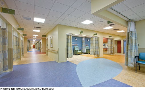
The ED ambulance and walk-in entrances both lead to a triage area where patients with minor aches, pains and lacerations can be attended to and sent home. "It's not fair to tie up very high cost and high-end technical treatment rooms in the clinical ED for somebody who could really be treated in a much lesser acute setting," says Rolando Sanz, AIA, principal-in-charge at Wilmot Sanz.
Next to triage is a fast-track area where somewhat more serious cases are treated. The most serious cases are seen in treatment bays arranged in four pods in an open design with total visibility from the nurse stations. Sliding glass doors on the treatment bays provide privacy and noise control.
One of these pods is built to serve pediatric emergency patients and inpatients. This hybrid design makes the most efficient use of pediatric specialists and square footage by not having to maintain and staff a separate pediatric inpatient unit that may experience seasonal lulls in its patient census. It also allows children who need to be admitted to the hospital from the ED to stay with the same care team.
Just off the ambulance entrance is a six-room behavioral health ED. Security and safety are paramount in the design of this area, but it also has floor patterns, accent paints and attractive furniture for a noninstitutional look and feel.

A small imaging department with X-ray and computed tomography equipment is located adjacent to the ED, and the hospital laboratory and pharmacy are on the same floor.
'Great place to practice'
Besides creating a more prominent entry and larger, more efficient ED, the other main goal of the expansion project was to relocate as many beds as possible from the existing hospital into the new patient tower. The project team was able to move all the beds — and even add a few more — and stay within the original budget.
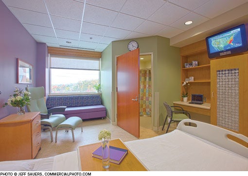
The former rooms were semiprivate and 198 square feet in size. Each new private room covers 300 square feet, allowing space for family members to be involved in patient care. "That's really an important thing," says Kirby.
The isolation and bariatric rooms are fitted with patient lifts. The remaining patient rooms have the infrastructure for lifts to be added at a later date.
The addition opened last November; by February, the hospital already had reached capacity and broke its record for patient volume.
According to Kirby, physicians are happy with the space and privacy the facility allows for patient care, and they have been great proponents of the hospital. She says physicians have said to her, "'Boy, is this a great place to practice medicine.'"
Amy Eagle is a freelance writer based in Homewood, Ill., who specializes in health care-related topics. She is a regular contributor to Health Facilities Management.
| Sidebar - Fitting into a tight spot |
| Franklin Square Hospital Center in Baltimore is hemmed in on all sides by neighboring buildings and major roadways. When the hospital recently expanded its facility, there was almost nowhere to go but up. A zoning variance was granted to allow the construction of an eight-story replacement patient tower at the hospital. The new addition also includes a larger emergency department (ED) and a more prominent, centrally located main entrance. A new central energy plant was built on site as well. The building is located on a body of ancient, clay-rich sedimentary rock. "When it gets wet, it expands and contracts," says Dennis Kephart, senior director of facilities at the hospital center. The builders conducted site drillings to determine the soil quality at different depths, then drilled more than 80 feet in places to get past the clay and install caissons and footers in more stable soil. The new energy plant is designed for efficiency. The hospital projected the new equipment would use 25 percent less energy per square foot than the equipment used previously, but the initial, actual savings have been about 44 percent lower than even that estimate, Kephart reports. The addition is attached on two levels to one side of the existing building. Kephart says this design was relatively easy to build and required little renovation of existing spaces. Care was taken in the design to ensure the ED and patient tower maintain vital connections to services in the older part of the hospital, like the dietary, surgical and radiology departments. The brick and precast banding on the addition relate to the existing building, while the new glass canopy and meditation garden give the facility a "new, sparkling look," says Rolando Sanz, AIA, principal-in-charge, and Curt Mugge, AIA, project manager, Wilmot Sanz Inc., Gaithersburg, Md. |
| Sidebar - Flooring leads the way |
| Flooring plays a number of important roles in the design of the new addition to Franklin Square Hospital Center in Baltimore. In the lobby, porcelain tile covers the most heavily travelled public thoroughfares, while carpeting is used in seating areas. Together, the two materials provide durability, softness and style. "We tried to keep it as sophisticated and elegant as possible," says Stephanie Glusman, interior designer at Wilmot Sanz Inc., Gaithersburg, Md. The neutral colors of the lobby flooring add to this impression. In the patient tower, "we tried to incorporate soft curves and order" in the flooring design, says Glusman. "In a hospital that big you want landmarks as you're walking down the floor. It was organization as well as aesthetics that went into play there." Variations in the flooring pattern help identify care stations and patient rooms to assist in wayfinding. Flooring patterns also define spaces within patient rooms, such as patient and family zones, and add interest to the design. Sunbursts and stars matching the logo of the hospital's Todd Heap Family Pediatric Center lend a playful appearance to the flooring of the patient rooms and corridors in the pediatrics department. Richly hued floors in the pediatric waiting area and playroom engage with the colorful murals in these spaces to give young patients a more cheerful healing environment. Marmoleum, a linoleum product from Forbo Flooring Systems, Hazleton, Pa., was used extensively in the new addition for its antistatic, antimicrobial, sustainable and low-maintenance properties. "We decided not to introduce any waxable products in the building, so the floor would remain low maintenance for its life cycle," Glusman says. "We looked at the maintainability [of materials]," says Dennis Kephart, senior director of facilities at the hospital center. "We don't wax the floor, we just clean the floor." |
| Sidebar - SPEC SHEET |
| Principal Design Materials Carpet: Tandus Flooring Inc. Ceiling: Armstrong World Industries Curtainwall framing: Kawneer Door hardware: Corbin Russwin Inc. and Ingersoll Rand Security Technologies Doors: Marshfield DoorSystems Inc. and Overhead Door Corp. Flooring: Forbo Flooring Systems Glass: JE Berkowitz Lighting: Columbia Lighting Paint: Sherwin-Williams Co. Plumbing accessories: Chicago Faucets, Josam Co. and Lawler Manufacturing Co. Plumbing fixtures: American Standard, Clarion Bathware, Haws Corp. and Just Manufacturing Inc. Roofing: Garland Company Inc. Signage: Apple Signs Inc. and Inter Sign National Tile: Crossville Inc. Window treatments: MechoShade Systems Inc. Precast concrete: Arban & Carosi Inc. and Shockey Companies Principal Furnishings Casework: Harney Woodworking and Herman Miller Inc. Conference tables: Rapp Productions Inc. Files and shelving: Global Lounge seating: Carolina Business Furniture Office desks: First Office Office seating: Exemplis Corp. Patient beds and over-bed tables: Hill-Rom Patient room seating: Brandrud, Coalesse and Exemplis Corp. Woodworking: Harney Woodworking Interior panel system: Marlite Major medical equipment Imaging equipment: Siemens Medical gas booms: Hill-Rom Infrastructure Boilers: Babcock & Wilcox Co. Building management system: Siemens Chillers: Trane Inc. Electricalequipment: Schneider Electric Elevators: ThyssenKrupp Elevator Fire safety: Siemens Generator: Caterpillar Inc. Air handling units: TMI Custom Air Systems and Trane Inc. Information provided by Wilmot Sanz Inc. |


