Standing Out
Project Overview
Project NameThe Methodist Outpatient Center
Location Houston
Total floor area (in square feet) Building (824,000) and garage (776,000)
Number of floors 26
Construction cost $248 million
Groundbreaking September 2006
Opening July 2010
Project Team
OwnerThe Methodist Hospital System
Architect and Interior Designer WHR Architects
Program Manager Broaddus & Associates
General Contractor Hensel Phelps Construction Co.
Environmental Graphic Design fd2s
MEP Engineering Smith Seckman Reid Inc.
Structural Engineering Haynes Whaley Associates
Civil Engineering, Parking Consultant and Traffic Engineer Walter P Moore
Medical Equipment Planning Genesis Planning
Landscaping Kudela & Weinheimer
Commissioning Agent Sebesta Blomberg
Materials Management and Handling Lerch Bates
Elevator consultant Persohn/Hahn Associates Inc.
Fire protection engineering Rolf Jensen & Associates Inc.
Wind Engineering Consultant RWDI
Air Dispersion Consultant Ambient Air Technologies
Vibration/Acoustic Consultant Hoover & Keith Inc.
View "The Methodist Outpatient Center | Houston" Gallery
The Methodist Hospital's new 1.6-million-square-foot outpatient center at the Texas Medical Center in Houston features state-of-the-art equipment and design, but Anthony Haas, AIA, FACHA, senior principal and senior medical planner for Houston-based WHR Architects, would rather not call it the facility of the future. He prefers to think of it as a facility with a future.
The Methodist Hospital System expects more than 310,000 outpatient visits each year at the center, which houses nearly all of The Methodist Hospital's outpatient services, including orthopedic surgery, cardiovascular imaging, radiology, cancer care, weight management and wellness.
Serving all these patients at the main hospital, a collection of buildings that dates to the 1950s, had become complicated, especially for patients trying to find their way around. Sid Sanders, senior vice president, The Methodist Hospital, says the Methodist Outpatient Center gives the hospital a chance to start anew with a building that is big but easy to understand, well-designed and "just a pleasant place to be."
Pushing the limits
The facility is connected by pedestrian bridges on the second and third floors to The Methodist Hospital, located across the street, and is covered by the same license as the main hospital.
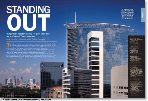
The outpatient center's most prominent tower rises 26 floors; measuring 512 feet from street level to the top of its highest spire, it is, according to WHR spokesman Michael Jones, the tallest building in the densely populated Texas Medical Center.
Most people receiving health care these days expect to get well, so facilities must differentiate themselves through services and good design, Haas says. "That's what this project was really about — trying to push the limits a little bit … to really make it soothing."
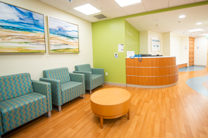
The interior design has a calming seascape theme that is expressed throughout the building in artwork, including many pieces by hospital staff members. The inclusion of staff artwork gives employees a sense of ownership in the building and helps patients connect with caregivers, says Lori Foux, RID, IIDA, LEED AP, associate and senior interior designer, WHR.
The seascape theme is reinforced through many other aspects of the design. The focal point of the two-story lobby is a large water feature that extends from the first to the second level. The second-floor café includes translucent panels decorated with a bubble pattern. On the diagnostic and treatment floors, where infection control is paramount, the reflective quality and blue and green colors of water are provided by inset glass and glass mosaic boxes that are easy to clean.
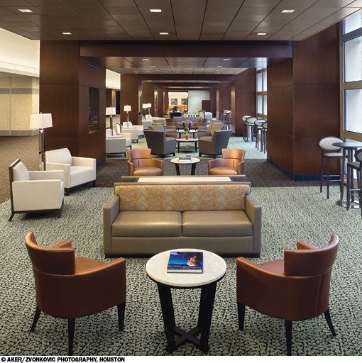
Dark wood lends a warm, hospitable feel to the interior, with lighter wood mixed in to create texture. Dark-toned carpet insets in the stone flooring add warmth to the entry on level one. On level two, where the main public elevator lobby and a number of public amenities draw foot traffic, darker carpet designed to hide stains also helps control noise.
The neutral backdrop of the flooring allows for greater flexibility in upholstery patterns. Much of the seating is covered in polyurethane or vinyl, with patterned fabric framed in wood on the backs of chairs, where the fabric is less vulnerable to staining. "The goal is always to have the building looking as new as possible for as long as possible," Foux explains.
Let the light shine in
Exterior glass walls allow light to penetrate the building and provide views that help with wayfinding. On all floors, the primary visitor circulation paths are located on the perimeter, with views and daylight. "The building's main floor plate is 68,000 square feet — that's an acre and a half," says Sanders, noting that natural light makes the large space easier to navigate and more enjoyable to be in.
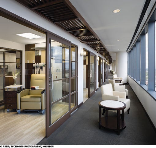
In the infusion treatment area on level 21, private treatment rooms are aligned along the exterior corridor. Each of these has sliding glass doors that open onto a porch-like seating area where patients can enjoy the view and visit with family, friends and other patients. Whitewashed wood-look flooring, lighting sconces at each doorway and a slatted wood pattern in the ceiling that is reminiscent of a beach house canopy add to the patio atmosphere. A patient who wants privacy can retreat into his or her treatment room and draw a curtain across the sliding doors. Those who wish to socialize more may choose group treatment rooms that can support up to four patients at once.
On the surgery floor, more than 50 private preoperative/recovery rooms are oriented perpendicular to the exterior wall to give patients window access. "If you tried to put five or 10 of those along the glass, it means the other 40 wouldn't have it," says Haas. This layout lets anyone step into the corridor and look outside.
The 14 operating suites are all more than 650 square feet and are same-handed, to be used by any specialty. These are arranged in two pods with a racetrack configuration and a central sterile core. A second, shelled surgery floor will allow the center to add 14 more ORs as necessary.
Sanders describes the interweave of patient comfort and technologically advanced, efficient workflow on the surgical floor as "stunning in its scale." Large, open floor plates allow health care planners to "model your ideal flow without ever making the patients feel like they're in a machine," he says.
Flexible future
The facility's shelled space and flexible design has allowed the hospital to consider installing advanced modalities like interventional radiology suites.
While outpatient design generally is less complex than that for inpatient care, "we put in as much sophistication as we could to give them the ability to plug and play and change," Haas says.
As the hospital contemplates future services, the building "gives [them] the flexibility to say, 'If we want to or need to, we can.'"
Amy Eagle is a freelance writer based in Homewood, Ill., who specializes in health care-related topics.
Sidebar - The Crowning touch
Sidebar - Rethinking respite space
Sidebar - SPEC SHEET


