Driven design

Project Overview
- Project Name: Virtua Voorhees replacement hospital
- Location: Voorhees, N.J.
- Total floor area: 676,000 square feet
- Number of floors: 7
- Number of beds: 368
- Project cost: $463 million
- Construction cost: $342 million
- Groundbreaking date: March 2008
- Opening date: May 2011
Project Team

View "Virtua Voorhees | Voorhees, N.J." Gallery
- Owner: Virtua
- Architect, interior designer, MEP engineer, structural engineer and landscape designer: HGA Architects and Engineers
- Project Manager: Hammes Co.
- Construction Manager: Turner Construction Co.
- Environmental Consulting and Civil Engineering: Dewberry
- Medical Equipment Planning: KJWW Engineering Consultants
- Signage Designer: ex;it
When Virtua, a health system based in Marlton, N.J., set out to replace its Voorhees, N.J., hospital facility, the system turned to a set of tools it has come to trust — Six Sigma process improvement and Lean design.
"We've done a lot of Six Sigma work in quality and safety, as well as cost, for the past 11 years. Six Sigma and Lean design are built into our everyday work here at Virtua. That's just the culture. That's the way we do things, in a very specific, detailed way," says Virtua CEO Richard Miller.
The Six Sigma and Lean approaches use data gathering and analysis to develop workflow and environments that promote efficiency and high-quality results. The health system worked with health care consultants Hammes Co., Brookfield, Wis., and the Milwaukee office of architecture, engineering and planning firm HGA Architects and Engineers to create the Virtua Voorhees replacement facility.
While Six Sigma and Lean directed the operational layout of the facility (see sidebar on page 15), HGA also used a carefully studied process that rated people's reactions to a variety of images including local landmarks and landscapes, as well as different types of building projects, to develop "design drivers" or guiding principles that influenced the hospital's aesthetic attributes.
Natural harmony
Virtua Voorhees was built on a 125-acre greenfield site that required water, sewer, gas and electrical upgrades.
According to Michael A. Solak, senior project executive, Hammes Co., about 60 percent of the site was usable land. "The remaining land is really left to its original state," he says.
The project team incorporated the existing landscape into the design of the hospital campus. Wetlands were respected and ponds were created during the project, with walking paths installed near forested areas.
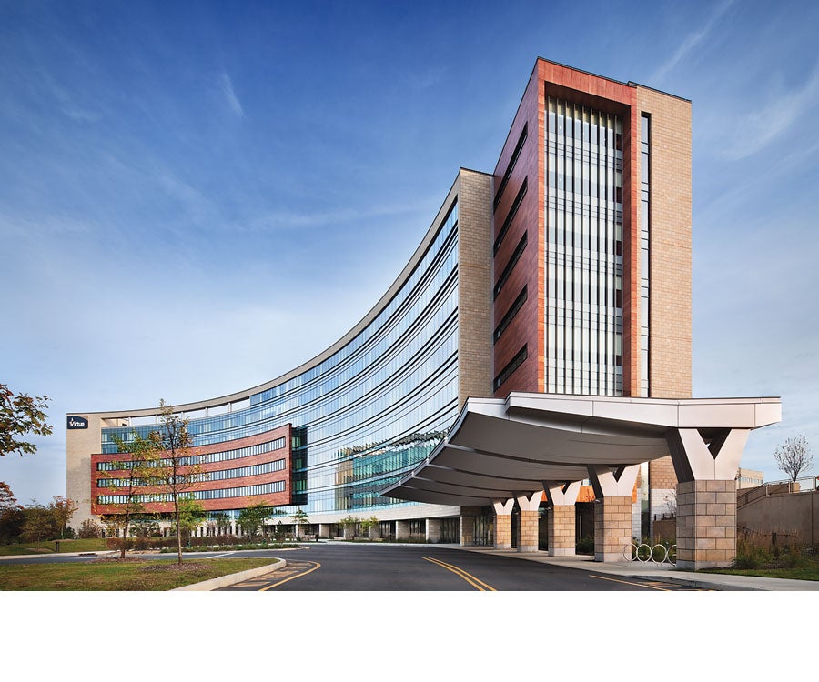
The patient tower is slightly curved to help fit the 676,000-square-foot building onto the somewhat narrow site. The curved design also focuses views from the patient tower onto the natural wetlands.
The site inspired the materials used in the hospital's construction. The exterior of the building features simulated sandstone accented by phenolic resin panels of real wood veneer. These materials "create a real harmony, and something that's indicative of what was basically unearthed from the site," says Mark Debrauske, AIA, project lead designer, HGA.
Human scale
To make the large hospital easier to navigate, it is divided into separate areas for adult medical-surgical services, women's and children's services, obstetrics, adult emergency care and pediatric emergency care. Exterior signage directs patients and visitors to the appropriate entrance.
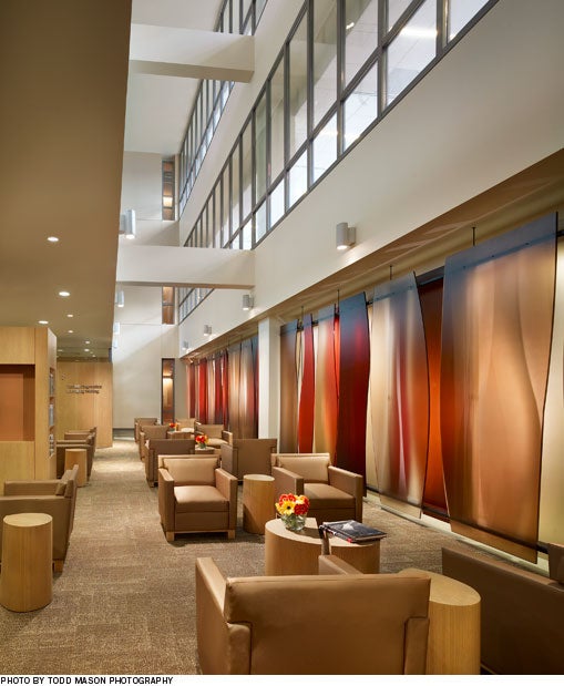
The entry lobbies and other main public spaces, such as retail and dining areas, are designed on a smaller, more human scale, to make people feel comfortable in the hospital environment.

"[At a hospital], you're not necessarily looking for excitement. We want to reduce any anxiety and anxiousness by doing the antithesis of the large hotel lobby," says Debrauske. "The whole public aspect is pretty low-key, pretty calm — and yet a rich experience — because you're always connected to the exterior," he says. Large windows provide natural light and views that help people relax and orient themselves.
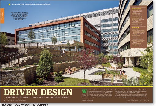
Courtyards give patients, visitors and caregivers direct access to garden spaces in the interior of the building's diagnostic and testing block. "If you've been at work all day, or you've been visiting your family member all day, you can poke your head out and breathe some fresh air for five minutes" without having to walk all the way to the front door of the hospital, says Kelly Brainerd, IIDA, interior designer, HGA.
The stone and wood materials seen on the building's exterior are carried through in the interior design. Granite is installed in each of the hospital's five main entrances, and the interior doors are manufactured of rift-cut oak.
The designers were mindful to include natural wood in places like the armrests of chairs in waiting areas and patient rooms, where people can touch and feel the warmth of the material.
Brainerd notes that advances in wood finishes ensure the surfaces can be cleaned with a diluted bleach solution and are "very durable for a health care setting."
Long-range design
The hospital has 368 private patient rooms. Of these, 72 are specially designed to accommodate the mother-baby experience. The rest implement a universal room concept that will enable the hospital to adjust each room's acuity level as needed.
"Changing the type of patient we see on a unit is really just a matter of staffing," says Michael Kotzen, Virtua Voorhees COO.
The patient rooms include a custom bedside cabinet with a bench that provides convenient seating for physicians and visitors. Custom over-bed tables feature trays for wireless keyboards.
According to Debrauske, the scale of the hospital allowed for such customization without adversely affecting the budget. "That was really a great opportunity for us to tailor this facility exactly to Virtua without adding any extra cost to the project," he says.
"The cost of health care is significant," says Miller. "You want to make sure you have a building that is sustainable for the long term." The size of the facility's site, the building infrastructure and the universal room design all are intended to help the hospital adapt to future growth and change.
The building, which is targeted for Silver certification from the U.S. Green Building Council's Leadership in Energy and Environmental Design program, is also environmentally sustainable.
'It works'
Miller credits the success of the project to careful planning and teamwork. "That's where tools like Six Sigma [and] Lean come into play," he says.
Process improvement tools that originated in manufacturing "can work very well in health care," says Miller.
"When you know how to use the toolkit, and you map out the strategy and design very carefully, it works."
— Amy Eagle is a freelance writer based in Homewood, Ill., who specializes in health care topics.
Sidebar - Six Sigma and Lean help drive quality and efficiency
Sidebar - Patient peace and safety stressed in corridor design
Sidebar - Spec Sheet


