Beyond boundaries

Project Overview
- Project Name: Nationwide Children's Hospital
- Location: Columbus, Ohio
- Total floor area: 750,000 square feet
- Number of floors: 12
- Number of beds: 293
- Project cost: $430 million
- Construction cost: $295 million
- Groundbreaking date: September 2008
- Opening date: June 2012
Project Team

View "Nationwide Children's Hospital | Columbus, Ohio" Gallery
- Owner: Nationwide Children's Hospital
- Architect: FKP Architects
- General Contractor: TurnerSmoot Construction
- Associate Architect: Andrews Architects Inc.
- Interior Specialist: Ralph Appelbaum Associates
- MEP Engineering: HAWA Inc.
- Structural Engineering: Jezerinac Geers & Associates Inc.
- Civil Engineering: EMH&T
- Medical Equipment Planning: Equipment Collaborative
- Landscaping: Olin and MSI | KKG
- Environmental Graphics/Wayfinding: Formation
Information provided by FKP Architects
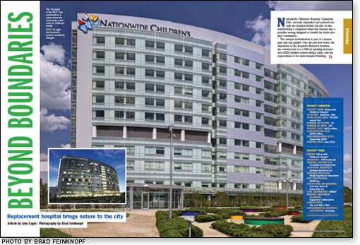
Nationwide Children's Hospital, Columbus, Ohio, recently expanded and updated not only the hospital facility but also its site, transforming a congested inner-city campus into a parklike setting designed to benefit the entire hospital community.
The campus revitalization is part of a master plan that has guided, over the past five years, the expansion of the hospital's Research Institute, the construction of a 1,500-car parking structure and LEED-certified central energy plant, and the replacement of the main hospital building.
The replacement hospital, which opened in June 2012, nearly doubled the size of the Level I emergency department, created space to care for a fast-growing volume of patients and improved hospital programming and amenities. This included adding an underground parking garage and six acres of green space to the medical campus.
"This work went beyond the boundaries of the hospital," says Ed Huckaby, FAIA, ACHA, ACHE, senior principal and pediatric design practice leader, FKP Architects, Houston.
Welcoming presence
Hospital CEO Steve Allen, M.D., says the expanded campus, which adjoins the oldest city park in Columbus, gives the facility a more welcoming presence in its neighborhood, in which the hospital conducts a number of public health programs.
The new green space "also has an impact on the healing environment that we're trying to create here at Nationwide Children's Hospital," Allen says. "We thought it was important to bring that inside the hospital."
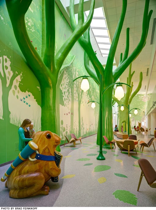
The two-story lobby atrium celebrates the natural world, with abundant daylight, views of exterior gardens and a forest-themed interactive play area (see sidebar on this page). A brightly colored motif of butterflies, wildflowers, falling leaves and other natural elements integrates the building's indoor and outdoor spaces. This motif, by museum design firm Ralph Appelbaum Associates, New York City, also was used in Research Building III, a research facility by the Columbus office of architecture and design firm NBBJ that opened at the same time as the replacement hospital. This visual branding element will be extended throughout the campus as existing structures are renovated.
Family focus
Improving the hospital experience for families was a primary concern in the design of the replacement hospital. "When a child is sick, it affects the entire family," says Allen. "We need to make sure that we manage the facility and construct it in a way that takes into account all their needs."
At approximately 300 square feet, the patient rooms are double the size they were in the existing facility, providing ample space for family members to stay with patients. Two people can sleep on the convertible sofa sleeper in the family zone of each room; a sleep chair reclines to a flat position to allow a third person to stay overnight, as well. Magnetic paint on the walls around the sofa provides an easy way to display greeting cards and similar items. Locking storage areas give family members a secure place to keep their belongings.

A color-changing LED light panel is mounted on the headwall above each patient bed. Patients can allow the colors to rotate automatically or stop the display on a favorite color (patients also can turn the unit off, if they wish). Seen from outside the hospital, the panels create a colorful light show at night.
Patient bathrooms feature custom-built bathtubs with low sidewalls that are comfortable for parents to reach over while bathing their children. Adjustable-height showerheads also are provided.
The bathrooms are nested on the footwall between each pair of mirror-image rooms, in a configuration resembling a bow tie. According to Huckaby, the bow tie configuration maximizes the floor area of the patient room, gives nurses clear sight lines and quick access to patients, and allows for expansive windows that optimize outdoor views and natural light.
Attention to detail
There are 48 beds on most floors, arranged in a racetrack formation with two 24-bed units per floor. These are divided into eight-bed "neighborhoods" served by an interior core that keeps critical supplies, medications, clean and soiled utility rooms and equipment storage nearby. A central corridor and service elevators provide a circulation route for offstage hospital functions.
Nurses can work at the patient bedside, at nursing alcoves just outside the patient room or at a large team station on each unit.
The patient floor layout is standardized, to control construction and operational costs and as a safety measure to help staff members who work on multiple floors deliver efficient, high-quality care on any unit. Other important safety measures employed in the design range from patient lifts installed in selected rooms to hand-hygiene dispensers located at every patient room doorway. In the intensive care unit, medical gases, power and data are supplied through overhead booms that can be rotated to allow medical equipment and the patient bed to be placed to fit the patient's needs.
The hospital's upper floors house specialty departments designed for rehabilitation therapy; neurosciences; endocrinology, renal and gastrointestinal acute care; and hematology, oncology and bone marrow transplant patients. The rehabilitation unit features a gym, a rock climbing wall and several environments in which patients can practice negotiating the real world, such as a full-sized car, a home kitchen, a school lunch line and restaurant seating.
"We paid attention to so many details that we think might make a difference in a patient's experience or the ability of the staff to deliver care," Allen says. "When your child is sick, everything matters."
Amy Eagle is a freelance writer based in Homewood, Ill., who specializes in health care-related topics. She is a regular contributor to Health Facilities Management.
Sidebar - Design magic brings nature inside
Sidebar - Design cues provide step in the right direction
Sidebar - SPEC SHEET


