Modern marvel

Project overview
- Project Name: Kent Campus, Phase II Expansion
- Location: Dover, Del.
- Total floor area (in square feet): 440,500 (pavilion – 245,000; central services building – 30,000; bridge – 7,000; 400-car parking garage – 139,000; existing building renovations – 18,500; all figures rounded)
- Number of floors: 3 (pavilion)
- Project cost: $148 million
- Construction cost: $124 million
- Groundbreaking date: December 2008
- Opening date: December 2011
Project team

View "Bayhealth Medical Center | Dover, Del." Gallery
- Owner: Bayhealth Medical Center
- Architect, interior designer, project planner, project manager, MEP and structural engineer, and lighting designer: EwingCole
- General Contractor: The Whiting-Turner Contracting Co.
- Civil Engineer and Landscaping: Becker Morgan Group Inc.
- Parking Garage Consultant: Timothy Haahs & Associates Inc.
- Commissioning Agent: Horizon Engineering Associates
Bayhealth Kent General Hospital, Dover, Del., recently completed the second phase of a master plan for the hospital facility, which originally was built in 1927 and has been expanded several times since. Howard Skoke, AIA, project principal for EwingCole, Philadelphia, describes the multifaceted plan as a way "to 'greenfield' a hospital that's been there many years."
Phase I updated and expanded the existing patient tower. Phase II involved the design and construction of a new pavilion, parking garage and central services building. The pavilion includes a new main entrance lobby, emergency department and trauma center, integrated cancer center and compounding pharmacy. It contains shelled space to accommodate future hospital needs, and is designed to support a 10-story patient tower. The central services building is fitted out for future expansion, as well.
The project provides the building platform, primary circulation and infrastructure framework to serve the hospital for years to come. Terry Murphy, Bayhealth president and CEO, says the organization is looking to expand "over a 50-to-100-year time frame."
Public commons
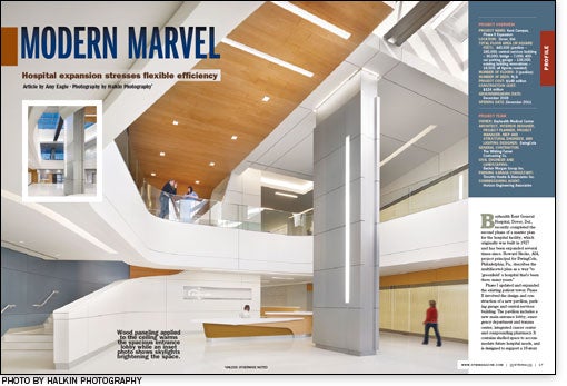
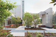
The pavilion's modern design features glass and metal panels, with brick elements that "harken back to the architectural heritage of Dover," according to Saul Jabbawy, director of design, EwingCole. The main entrance opens onto a two-story public space that contains a similar mix of modern and traditional materials, with metal columns, glass railings and light wood accenting a neutral white background. Skylights and large windows provide natural light and views to external landscaping.
Retail space and a pair of large conference rooms are located near the main lobby, as is shelled space for a planned medical education library with expanded meeting and seminar functions. The lobby is designed to serve as the public commons for the campus. "This is not just a place where you serve patients and then they leave," says Jabbawy.
The connecting walkway between the hospital and central services building is divided into a public corridor and a service corridor. The service corridor is sized to accommodate carts, small vehicles and, eventually, robotic transfer equipment.
To facilitate wayfinding, the project team worked with a signage consultant to develop a new graphic standard for signage used throughout the hospital. Colors and graphics identify key circulation nodes; elevator lobbies, for example, are paneled with back-etched glass featuring a large-scale pattern of flowers. A variation of this design is used inside the elevator cabs.
Expanded emergency care
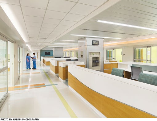
The hospital's new emergency department (ED) and Level III trauma center is nearly triple the size it was previously. The exam rooms are arranged in a pod formation, surrounding a central nurse station. Some exam rooms are oversized, to support a broad range of services.
The department includes a workroom for emergency medical services (EMS) personnel. Murphy says this has improved communication with EMS workers.
The ED is designed to expand in a modular fashion. More pods can be added to the south of the current building, in what is now green space. Two more floors also can be built above the new department.

Multidisciplinary partnerships
The new integrated cancer center houses radiation oncology on the first floor and medical oncology on the second floor. According to Murphy, the center's conference rooms and videoconference capabilities strengthen the hospital's cancer care team and its affiliation with clinical partners at the University of Pennsylvania Cancer Network. "Multidisciplinary care conferences are the best treatment plan for all modalities," he says.
Medical oncology and chemotherapy patients are provided with individual treatment pods in which they can read, watch television, use their own electronic devices or socialize during treatment. Natural light and art provide an environment in keeping with the patient-centered care philosophy of Planetree, the Derby, Conn.-based patient advocacy and research organization with which Bayhealth is a partner. The radiation oncology vault, says Murphy, "is one of the most soothing places in all our facilities."
Admixtures for chemotherapy are made specifically for each patient in the on-site compounding pharmacy. The pharmacy is connected to the laboratory by a pneumatic tube system; this allows laboratory draws to go directly to the unit, which creates a safer system for patients and can shorten what can be a long day of treatment, Murphy says.
An oncology staff lounge on the second floor features a large curtainwall opening overlooking the main entrance and green space. The use of this space, rather than a back-of-the-house location, is just one way the design illustrates how much the hospital cares about staff, says Skoke.
Strong results
Hospital data for the pavilion's first 5 1/2 months of operation show ED usage up 13 percent, with less than 2 percent of people leaving without treatment. The hospital's "top-box" score for the question on the Hospital Consumer Assessment of Healthcare Providers and Systems (HCAHPS) survey asking patients to rate their ED experience is consistently nine or 10, on a 10-point scale with 10 being the highest. Overall admissions are up 5 percent, and radiation oncology and medical oncology each have experienced an increase in patients. Murphy says that since patients often follow their respective physician's recommendation in choosing a hospital, he believes the higher admission figures are indicative of physician confidence in the facility.
A hospital with sufficient space that is patient-centered and appropriate to care creates strong results, he says.
Amy Eagle is a freelance writer based in Homewood, Ill., and a regular contributor to Health Facilities Management.
Sidebar - Historic transformation provides compatible fit
Sidebar - Interior finishes offer a backdrop
Sidebar - SPEC SHEET


