9 ways Northwestern Memorial Hospital's design was ahead of its time

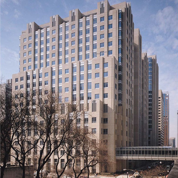
Despite renovations and expansions, NMH has been able to blend in with its busy, downtown Chicago location.)
Cutting edge is not a term typically attributed to a building with more than a decade under its foundation, but that’s just how those involved in the planning, design and construction of Northwestern Memorial Hospital (NMH) describe the 1999-built facility.
Sitting in one of Chicago’s major retail districts, NMH took 10 years to plan, and those involved in the project were guided by two simple words: “Patients First.”
“‘Patients First’ is the core mission of Northwestern Medicine and drives every decision that we make, including in our physical facilities,” explains Kristina Hedley, director of special affairs, Northwestern Memorial HealthCare. “It means that we listen to our patients, visitors and caregivers in order to design environments that feel comfortable and welcoming, and facilitate our ability to provide excellent medical care.”
NMH’s mission led to a design that melds aesthetics and functionality into a hospital that addresses the needs of patients and staff. It’s also led to several design awards, including this year’s Legacy Project Award given by the American College of Healthcare Architects.
Angela Mazzi, chair of the Legacy Project Award and ACHA Board of Regents member, says Northwestern was chosen for this award for its “vision and commitment that challenged current thinking at the time,” including design features that support patient-centered care and the flexibility to accommodate change. Because of its forward thinking, NMH not only managed to build something cutting-edge, but also enduring. Here are nine reasons the hospital’s design was ahead of its time.
Integrated care. NMH begins with an eight-story podium spanning two blocks. From that podium rise two towers: the Feinberg inpatient tower and its outpatient tower, Galter, which now has three floors of inpatient beds. While a typical 1990s design separated inpatient services from outpatient services, this design leverages a common diagnostic platform for both. NMH says that having a variety of specialties and services in one location “allows physicians to easily transition between inpatient and outpatient settings without ever leaving the building. This arrangement can save 15 to 20 percent of a physician’s time.”
On-stage, off-stage. NMH was an early adopter of this circulation model that completely separates patients from behind the scenes. Physicians and staff can move freely while a parallel corridor used by visitors provides ease of wayfinding and access to daylight, leading to a better patient experience.

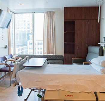
Spacious, private rooms encourage family members to visit patients as they recover.
Private rooms. It may seem passé now, but NMH was a pioneer not only of private rooms, also but of rooms that provide generous space for family members and other caregivers. Fold-out couches that transform into single beds and are placed near windows invite visitors to stay.
Seamless design: Rather than taking the “color of the year” and plastering it across its walls, as was the modus operandi in the 1990s, NMH went for a design that seamlessly integrates interior materials as part of the aesthetic. Makore wood panels and trim line the hospital’s feature walls and clad the desks in public areas, providing an air of hospitality. The woodwork, now aged to a rich, deep brown-red, contrasts with accents of off-white materials and is highlighted by marble and terrazzo.

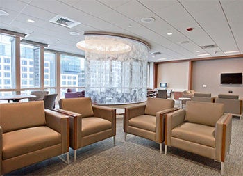
Family waiting rooms are located on a parallel corridor, separate from clinical functions.
Sustainability. Seventy-five percent of the flooring used in NMH is naturally based linoleum. The major public areas have terrazzo, which is a durable, time-tested flooring product, ideal for high-traffic areas.
Daylight and wayfinding: Public circulation is placed on the outside of the building, allowing for views of the Chicago skyline and Lake Michigan.
Integrating art: The hospital believes in the power of art to help heal patients by reducing levels of stress. It has a collection of landscape and pastoral settings strategically placed in public spaces.

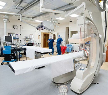
The hospital will expand to open eight new operating rooms this year.
Urban blend: NMH is located in a mixed-use, dense, downtown neighborhood. Rather than designing an institutional-looking facility that sticks out from its neighbors, the hospital developed massing, exterior materials, palettes and fenestration to blend within its context.
Flexibility: The chassis at NMH has been able to adapt to renovations and expansions over the years. In 2010, the Feinberg mezzanine was renovated to increase emergency department volume and more plans are underway to expand its footprint. The hospital was able to add 48 beds and relocate its 29-bed behavioral health unit in 2011, replacing a space that was originally occupied by clinical offices. It can add another 48 beds on contiguous floors. In 2012, the hospital began renovating and incorporating leading technology in all of its 62 operating rooms. With plans to open eight new ones this year, the hospital’s legacy continues to grow


