Color full

Facility: Phoenix Children's Hospital
Location: Phoenix
Architect: HKS Inc.
Lighting Design: Scott Oldner Lighting Design
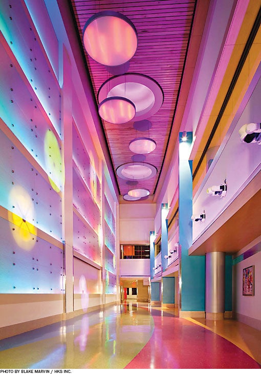
From the moment a person enters the new expansion of Phoenix Children's Hospital, he or she is bathed in bold, vivid colors, an experience that continues throughout the facility, thanks to a richly detailed lighting design.
The use of color gives the facility a playful, whimsical feel that helps achieve the hospital's mission of making its young patients and their families feel as calm as possible.
An example of the distinctive use of color is the light wall in the corridor leading to the dining room, where recessed lighting is programmed via computer to change colors. Flowers, water and other calming images are projected atop the light to add to the show of colors.
A nurses' station (inset) in one of the patient corridors is designed to evoke a homey look with its porch light, visible to the nearby patients. Each entrance has its own color to assist wayfinding.
The 11-story, 770,000-square-foot facility offers specialty care in dermatology, endocrinology, pulmonology, orthopedics and gastroenterology. With the expansion, the hospital grew from 345 to 626 licensed beds.
To submit a Last Detail case for consideration, contact Jeff Ferenc at jferenc@healthforum.com


