'Mountain Modern'
Project Overview
- Project Name: LeConte Medical Center
- Location: Sevierville, Tenn.
- Total floor area (in square feet): Hospital (194,940); Medical Office Building (30,627); Women's Center (32,285); and Cancer Center (16,125)
- Number of floors: Three
- Number of beds: 79
- Project cost: $115 million
- Construction cost: $74.8 million
- Groundbreaking: May 2007
- Opening: February 2010
Project Team
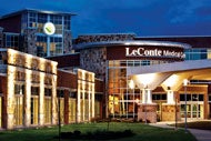
View "LeConte Medical Center | Sevierville, Tenn." Gallery
- Owner: Covenant Health
- Architect: BarberMcMurry architects (architect of record) and Earl Swensson Associates Inc. (health care design consultant)
- General Contractor: Rentenbach Constructors Inc.
- Interior Designer: Earl Swensson Associates Inc.
- MEP Engineering: I.C. Thomasson Associates Inc.
- Structural Engineering: KSi Structural Engineers
- Medical Equipment Planning: Balfour Resource Group
- Information Technology: Smith Seckman Reid Inc.
- Food Service Design: Inman Associates Inc.
- Pharmacy Design: MMI Systems
- Laboratory Design: Scott Laboratories Inc.
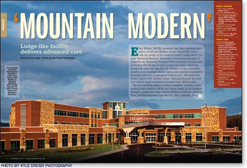
Ellen Wilhoit, FACHE, president and chief administrative officer of LeConte Medical Center, Sevierville, Tenn., calls the design of the medical center's replacement hospital "Mountain Modern." Sevierville is located at the edge of Great Smoky Mountains National Park in an area of rustic natural beauty. The design includes indigenous stone, wood and wood-look materials that give the hospital a lodge sensibility suitable to its mountain home, and a contemporary, sophisticated polish reflective of advanced medical care. "We wanted to create a new, really positive image" that goes beyond the medical center's small community hospital roots, Wilhoit says.
The new medical campus includes a hospital, women's center, medical office building (MOB) and cancer center. It was designed through a collaborative effort of BarberMcMurry architects, Knoxville, Tenn., and Earl Swensson Associates Inc. (ESa), Nashville, Tenn.
BarberMcMurry architects took the lead role in designing the women's center and MOB, while ESa led the functional planning and design of the hospital and cancer center.
Convenient flow
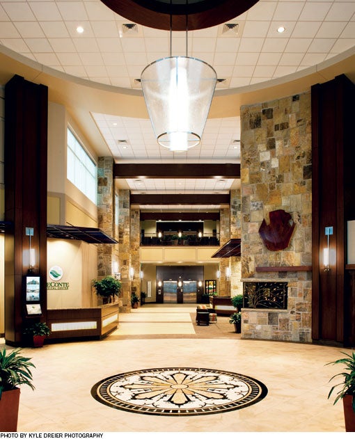
The hospital's main entrance opens onto a two-story lobby featuring the same natural stone used on the building's exterior. Wood-look laminate columns and resin panels with birch accents add to the natural feel.
"The surrounding area is just beautiful. We wanted to bring in those types of materials, the stone and the wood," says Jennifer Satterfield, IIDA, LEED AP, interior designer, ESa. A palette of soothing blue, green and terra cotta enhances the natural look throughout the hospital.
The lobby rotunda features a custom light fixture of contemporary design centered above a medallion pattern in the flooring. A reception desk, gift shop, dining area and chapel all are located near the entrance. "Everything for the public [is] right there at their fingertips," says Satterfield.
Enclosed walkways off each side of the entry lead to the women's center and MOB. To the right of the main lobby, there is a diagnostic waiting area for imaging and related services; to the left, is the surgical waiting room.
Patients are processed and escorted to the appropriate care area according to a specific flow pattern. The design is meant to separate public, patient and staff circulation routes to minimize cross traffic, explains Harold Petty, AIA, director of medical design and ESa's principal-in-charge on the project.
Expanded, efficient care
The hospital expects to see 50,000 patients in the emergency department (ED) this year, with about one-third of them being tourists at the national park and nearby towns of Gatlinburg and Pigeon Forge.
At the previous hospital, the volume of emergency care was about 40,000 patients per year in an ED built for 17,000. "That was one of the key reasons we needed a new facility," Wilhoit says.
In addition to being larger, the new ED has private treatment rooms for increased confidentiality, safety, security and comfort. A decontamination area addresses the newer threat of bioterrorism.
The ED is laid out for efficient patient flow. "Well-defined paths separate people coming in from people coming out," explains Craig Holloway, AIA, ESa project manager. Adjacent surgery and radiology departments enable patients to be moved swiftly to either area. A patient transport elevator located just outside the ED facilitates transfers to the intensive care unit.
The emergency, surgery and radiology departments are positioned on the periphery of the first floor to allow future expansion of any of these departments without compromising other areas.
Medical-surgical care
The facility's patient units are arranged in two L-shaped wings with a central elevator hub and support core.
The support core includes physician dictation rooms and similar staff workspaces, as well as secure medication storage and dispensing. A business station is located on each side of the elevator core to provide a work area for the unit secretary and such support members of the hospital care team as dieticians and therapists. There is a decentralized nurse station and supply area in each patient unit wing.
For additional privacy, the patient rooms feature inboard toilets that provide a buffer between the patient bed and the corridor, says Holloway. The design also allows for larger exterior windows to maximize views and natural light.
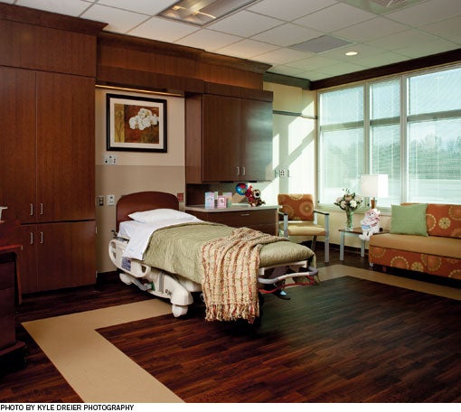
Laminate panels, designed with input from hospital staff, improve the look and functionality of the headwall in the patient rooms.
The custom-built units were a "relatively low-cost item," Holloway says, that "add a lot
of warmth to the room as
well as provide an opportunity to organize a lot of the chaos that's typically on the headwall."
Rather than place a nursing computer on an ergonomic arm, the team designed a narrow cabinet about six inches deep that can be closed and locked to store the computer securely and essentially out of sight.
Medical mission
According to Wilhoit, the facility is attracting new physicians, including some who practice in specialties the hospital previously had not been able to offer. She credits much of the success of the project to the support of the hospital's foundation and Covenant Health, the Knoxville, Tenn.-based, community-owned health system that includes LeConte Medical Center.
"Most hospitals our size wouldn't have the facility we have without these extra resources," Wilhoit says.
Holloway, who — like several members of the project team — has family in the Sevierville area who use this hospital, is grateful for the opportunity to serve patients through design.
He says, "We may not be able to be there on a daily basis ministering to people and being a part of that medical mission … but we can create spaces that allow people to do that work."
Amy Eagle is a freelance writer based in Homewood, Ill., who specializes in health care-related topics. She is a regular contributor to Health Facilities Management.
Sidebar - Hospital takes cues from its surroundings
Sidebar - Flanking buildings complete care picture
Sidebar - SPEC SHEET


