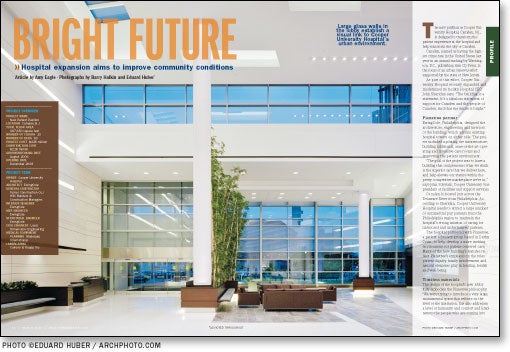
Bright future
View "Cooper University Hospital | Camden, N.J." Gallery
Project specs
- Project New Patient Pavilion
- Location Camden, N.J.
- Total floor area 297,650 square feet
- Number of floors 10
- Number of beds 90
- Project cost $225 million
- Construction cost $218 million
- Groundbreaking date August 2006
- Opening date December 2008
Project Team
- Owner Cooper University Hospital
- Architects EwingCole
- General contractor Turner Construction Co./ HSC Builders & Construction Managers
- Interior designer EwingCole
- Structural engineer EwingCole
- MEP engineer EwingCole
- Civil engineer Land Dimensions Engineering
- Medical equipment planning Medequip International
- Landscaping Cairone & Kaupp Inc.
The new pavilion at Cooper University Hospital, Camden, N.J., is designed to transform the patient experience at the hospital and help transform the city of Camden.
Camden, named as having the highest crime rate in the United States last year in an annual ranking by Washington, D.C., publishing firm CQ Press, is the focus of an urban renewal effort supported by the state of New Jersey.
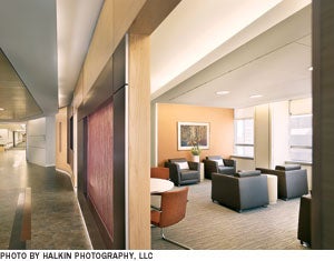
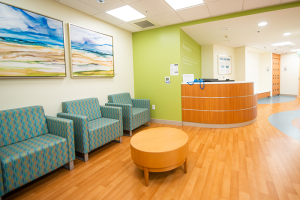
This family waiting area is designed to provide privacy from the facility's main corridors.
As part of this effort, Cooper University Hospital recently expanded and modernized its facility. Hospital CEO John Sheridan says, "The building is a statement. It's a fabulous statement of support for Camden and the people of Camden. And that the future is bright."
Planetree partner
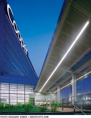
EwingCole, Philadelphia, designed the architecture, engineering and interiors of the building, which adjoins existing hospital towers on either side. The project included updating the infrastructure, building additional, state-of-the-art operating and intensive care rooms and improving the patient environment.
"The goal of the project was to have a building that complements what we think is the superior care that we deliver here, and help elevate our stature within the pretty competitive marketplace we're in," says John Schwarz, Cooper University vice president of facilities and support services.
Camden is located just across the Delaware River from Philadelphia. According to Sheridan, Cooper University Hospital needs to attract a large number of commercial pay patients from the Philadelphia region to maintain the hospital's strong mission of caring for uninsured and underinsured patients.
The hospital partnered with Planetree, a patient advocacy group based in Derby, Conn., to help develop a more inviting environment for patient-centered care. Many of the new building's features reflect Planetree's emphasis on the roles patient dignity, family involvement and natural elements play in healing, health and well-being.
Timeless materials
The design of the hospital's new lobby fully embodies the Planetree philosophy. "We were trying to introduce a very large, monumental space that reflects on the level of the institution, but also addresses a level of humanity and comfort and kindness to the people who are coming into that space," says Saul Jabbawy, director of design, EwingCole.
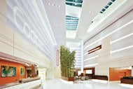
Light fills the lobby from floor-to-ceiling windows, large skylights and decorative lighting features built into the walls. This is complemented by stonelike white walls and flooring. "No matter how styles change, the presence of light is always going to be comforting. White stone, over time, will remain relevant," Jabbawy says.
Bamboo that reaches two stories high introduces color and life into the space. The bamboo was also chosen for its timeless quality, as were the lobby's wooden planters. Bench seating along the planters allows visitors to touch and feel the natural material.
Panels by 3form Inc. (www.3form.com), Salt Lake City, spell out the word "Cooper" in large, translucent letters above the reception desk. "We wanted to create a strong identity when you come up to that reception desk, but to do it in a light fashion," says John Capelli, AIA, principal-in-charge, EwingCole. The hospital can change the lighting in the lobby to create different effects.
A 90-seat restaurant, coffee shop, vending area, business center, health resource center, chapel and healing garden are all located off the lobby.
Care and comfort
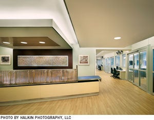
Featuring wood and natural grass embedded in an acrylic material, this nurses' station is designed to resemble a reception deak at a hotel or spa.
Similar design elements are used on the upper floors. Wood-look materials and 3form panels appear in the
elevator lobbies, family respite areas, nurses' stations and patient rooms.
All of the patient rooms are private. At approximately 300 square feet, the medical-surgical rooms are efficiently designed, with features meant to benefit patient care and comfort.
The bed in each medical-surgical room is angled toward wall-to-wall
windows to provide the patient a better view outside. This also gives nurses a clearer view of the head of the bed from the doorway.
Medical outlets are positioned to the side of the headwall in such a way that they are accessible to staff but largely unnoticeable to patients and family. This way, staff members do not have to reach over patients to use medical devices and family members do not have to see a battery of devices over their loved one's head as he or she lies in bed.
The caregiver hand-washing sink is located in an alcove just inside the patient room, to give the room a less clinical look. Medical equipment and waste is kept behind doors in the hand-washing alcove and in a separate storage and work area near the door.
As Jabbawy notes, "It doesn't matter how much you spend on the millwork, or the quality of the finishes, the presence of clinical equipment begins to create a sense of anxiety. So the strategy was very, very specific: Eliminate all evidence, as much as possible, of medical equipment from the sight of the patient or the family."
Quality space
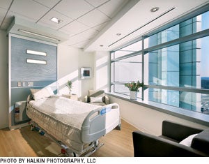
In this patient room, the bed is oriented to take advantage of daylight and equipment is minimized by a unique headwall configuration.
The architects say it was important to the hospital to keep the level of design high even outside public areas.
For instance, a number of measures were taken to ensure the clinical laboratory, in the basement of the building, is a quality space.
Transom windows funnel natural light into this area, multiple coves in the ceiling provide visual interest and all offices include a glass element to prevent employees from feeling isolated.
The offices are located on the perimeter of the area; they are designed from modular wall systems that will be simple to remove when the hospital needs to expand the laboratory. "We're constantly challenged to find new space, and that was a creative solution," says Schwarz.
Throughout the new building, he says, the hospital's physical space is now equal to its clinical operations.
Amy Eagle is a Homewood, Ill.-based freelancer who frequently contributes to Health Facilities Management.
Sidebar - Addition helps rejuvenate downtown
Sidebar - Walkway bolsters claim to world class care
Sidebar - Spec Sheet


