Natural beauty
Project specs
Project St. Anthony Hosptial
Location Gig Harbor, Wash.
Total floor area 250,000
Number of floors 5
Number of beds 80
Construction cost $95 million
Project cost $160 million
Groundbreaking February 2007
Opening date March 2009
Team Members
Owner Franciscan Health System
Architect ZGF Architects LLP
Owner's Representative Hammes Co.
General Contractor Sellen Construction Co.
Interior Designer ZGF Architects
Mechanical Engineer CDi Engineers
Electrical Engineering Coffman Engineers
Structural Engineering PCS Structural Solutions
Civil Engineering DOWL HKM (formerly DOWL Engineers)
Landscaping SiteWorkshop
Medical Equipment Planners Catholic Health Initiatives and ZGF Architects
St. Anthony Hospital, designed by the Seattle office of ZGF Architects LLP, is the first built in Gig Harbor, Wash. The town's location on Puget Sound makes emergency transportation to other areas difficult; the nearby city of Tacoma, Wash., for example, is across the nearly 6,000-foot-long Tacoma Narrows Bridge.
In designing and building a local community hospital for Gig Harbor, the project team strove to develop a facility that truly embodied its surroundings.
The hospital is operated by the Franciscan Health System, a faith-based organization affiliated with Catholic Health Initiatives, Denver. With St. Anthony Hospital, the health system says it is working to fulfill its central mission of creating healthier communities.
Civic landmark
Allyn Stellmacher, AIA, LEED AP, design partner, ZGF, notes that while architecture students are taught libraries and city halls are important local monuments, community hospitals are also strong civic markers that bring people together and represent the character of an area. At St. Anthony Hospital, "the building wanted to be simple and understated to maximize that community connection," says Anita Rossen, senior interior designer, ZGF.
The hospital is designed to blend gracefully into its site; the natural and built environments relate closely to one another in appreciation of the area's natural beauty. The community's long history with the commercial fishing and boat-building industries is highlighted in numerous aspects of the hospital design.
The area's Native American heritage is honored in an art program that showcases the work of local artists throughout the facility. This includes a prominently displayed handmade wooden canoe that illustrates the spirit and craftsmanship of area residents.
A chapel positioned adjacent to the hospital's front entry gives precedence to the Franciscans' sense of faith. Light fixtures in the chapel reference lighthouses and beacons, which Stellmacher says the architects felt were important spiritual components to the community. A small, outdoor reflecting pool that can be seen through floor-to-ceiling glass lends the impression of being on the water to those inside the chapel, imagery well-suited to the area's maritime heritage and the hospital's Catholic ministry.
Simple design
The understated design carries into the patient care areas of the hospital. "Simplicity can be better," Stellmacher says. "The last thing anybody needs in a medical facility is something that's complicated to navigate or understand."
 |
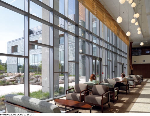
| The garden-level lobby offers a visual respite for patients, visitors and staff. |
This goes for staff as well as visitors. For the benefit of all users, St. Anthony Hospital is laid out with simple circulation routes and departmental adjacencies with natural light and views as intuitive wayfinding cues.
"It functions very well from an operational perspective," says hospital President Carole Peet. "It's very easy to navigate." She notes, in particular, the facility's second floor, which contains all of the hospital's surgery and interventional services.
According to Stellmacher, this area is designed to adapt to different care models, such as interventional surgeries, as they evolve. Generic space in the building will be able to accommodate changes in patient flow requirements and the needs of support staff, he says.
The attached medical pavilion enables physicians to walk directly across a connecting bridge to perform surgery and see post-operative patients at the hospital. The physicians "really, really appreciate that," says Peet.
Maximum visibility
The hospital's patient units have a straightforward design that allows for maximum visibility between nurses and gives the hospital a great deal of flexibility in regards to staffing models, patient types and acuity types.
The 32-bed units are arranged in neighborhood pods along straight corridors. Each pod has its own large, central nurses' station and support areas. "We were trying … to shorten those walking distances, and thinking about the day-to-day back and forth from the patient room to the core for the staff," Rossen says. ZGF measured this design against a comparable patient unit at a different facility and found the walking distances at St. Anthony Hospital to be significantly shorter, allowing nurses more time at the bedside delivering direct patient care.
The 230-square-foot private patient rooms are standardized to simplify caregiving. Full-height windows at each end of the patient unit corridors brighten the units with natural light and views.
Peace and quiet
Peet says she continues to be amazed by the sense of space and cleanliness in the new hospital, even after a year of operation.
"I can walk through this hospital on any given day and there's nothing in the hallways," she says. "There's no clutter. That is so different from what you typically feel in a building."
 |
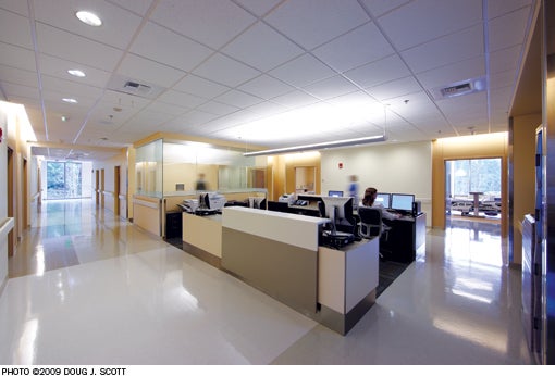
| Nurses' stations in the med-surg unit have access to natural daylight, while a glass-enclosed flex-room provides space for private meetings and conversations. |
She says, too, that "because of the way the building is designed, it is so quiet you have no sense of how busy we are," even when the hospital is full.
She adds that many patients have commented upon discharge that they don't want to leave the hospital because it is such a beautiful building and they've enjoyed being cared for there.
The peaceful environment exemplifies the Franciscan Health System's stated vision for healing the body, mind and spirit. The hospital is positioned on the site to allow for future expansion without compromising the simplicity of the layout or the importance of the landscaping.
Hospital buildings "carry a huge burden relative to other buildings we may construct in the world," Stellmacher says.
At St. Anthony Hospital, the project team worked to deliver straightforward solutions to the complex issues of hospital design and construction, while remembering the most important feature of a community hospital. As Rossen says, this is more than just a building, "this is about people."
Amy Eagle is a Homewood, Ill.-based freelance writer and a regular contributor to Health Facilities Management.
| Sidebar - Becoming one with the native habitat |
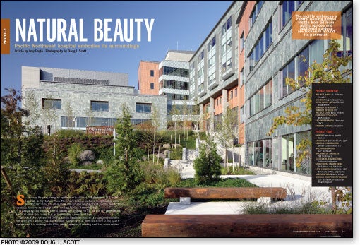
| The woods around St. Anthony Hospital were influential to the building's design, both literally and figuratively. The 30-acre greenfield site was densely forested and included wetlands and a salmon stream. To preserve the peaceful, healing atmosphere, the hospital was integrated into the landscapedespite its more than 80-foot grade. Rather than cut a bench from the land and clear a platform for hospital construction, "we were able to nestle the building into the site, being careful with the grading," explains Allyn Stellmacher, AIA, LEED AP, design partner, ZGF Architects LLP. Quartzite, poured concrete and wood panels on the building's exterior blend the facility into the surrounding Douglas fir trees. More than half the property remains in its natural state; the wetlands and stream were conserved and portions of the site disturbed by construction were replanted with indigenous plants. The 200-foot setbacks of an existing power line are accommodated in the design. The hospital is focused around a garden that can be viewed from every public space. Every patient room has a view to either the garden or the woods. The interior design is oriented toward external views, with muted colors designed not to compete with the outdoor beauty. In addition, the designers used the idea of "A Walk in the Woods" as an organizing metaphor for the overall interior design. They identified the types of spaces one might encounter on a walk in the woods and associated these with architectural elements. Elevator lobbies, for example, were identified with meadows, which open up into a view. Diagnostic imaging, where there is less natural light, was identified with the calming nature of the denser forest. This idea unifies the interior design and helps ensure that transitions between areas—particularly in regard to lighting—occur in a more natural fashion that is not too abrupt for patients' and visitors' comfort. |
| Sidebar - Honoring maritime traditions |
| The design of St. Anthony Hospital, named for the patron saint of fishermen and sailors, honors the rich maritime traditions of Gig Harbor, Wash., in many often subtle ways. Gig Harbor was founded by fishermen and, as planning for the town's first community hospital was under way, local residents and project planners "wanted to make sure that they linked the community history with the facility," says hospital President Carole Peet. According to Anita Rossen, senior interior designer, ZGF Architects LLP, the goal was to pay tribute to Gig Harbor's heritage in a design that was sophisticated, warm and timeless, and to which a large number of people could relate. "We worked hard to avoid the big anchors in front of the building, things of that nature that one might find obvious," says Allyn Stellmacher, AIA, LEED AP, ZGF design partner. To gain a deeper understanding of the area, designers from ZGF photographed several local scenes, which they arranged in a collage posted above their work alcove. The collage "really became a part of our design sessions and part of the fabric of what we were relating to as we worked on the design," Rossen says. The images found their way into the building through many elegant gestures, such as pendant lights shaped like the glass floats formerly used in commercial fishing, circular vents that evoke portholes, reception desks clad in wood resembling the wooden planks of piers and fishing boats, and wavelike patterns on walls and flooring. In the chapel, vertical wooden louvers made to look like the tail fins of a boat are suspended from stainless steel pins; the wooden paneling features exposed metal fasteners similar to those used in boat construction. "It's a very subtle, very graceful design," says hospital spokesperson Gale Robinette. |
| Sidebar - SPEC SHEET |
| Principal Design Materials |


