A new vision of care
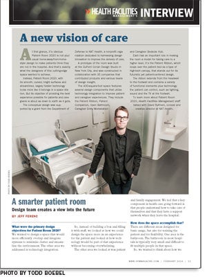
 At first glance, it's obvious Patient Room 2020 is not your usual home-away-from-home-style design to make patients think they are not in the hospital. And that's exactly what the designers of this cutting-edge space wanted to achieve.
Instead, Patient Room 2020, with its smooth, curved, bright surfaces and streamlined, largely hidden technology looks more like it belongs in a space station. But its objective of providing the best experience possible for patients and caregivers is about as down to earth as it gets.
The conceptual design was supported by a grant from the Department of Defense to NXT Health, a nonprofit organization dedicated to harnessing design innovation to improve the delivery of care.
A prototype of the room was built at the DuPont Corian Design Studio in New York City, and was constructed in collaboration with 35 companies that contributed products and various levels of design insight.
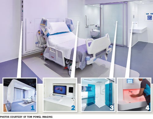
The 400-square-foot space features several design components that utilize technology integration to improve patient and caregiver experiences. They include the Patient Ribbon, Patient Companion, Open Bathroom, Caregiver Entry Workstation and Caregiver Bedside Hub.
Each has an important role in making the room a model for taking care to a higher level. It's the Patient Ribbon, which loops over the patient bed as a type of high-tech canopy, that stands out for its futuristic yet patient-centered design.
The ribbon extends from the headwall to the footwall and contains a variety of functional elements plus technology the patient can control, such as lighting, sound and the TV at the footwall.
To learn more about Patient Room 2020, Health Facilities Management staff talked with David Ruthven, co-lead and creative director at NXT Health.
What were the primary design objectives for Patient Room 2020?
We wanted to design a space that would more efficiently overlap and integrate systems to minimize clutter and streamline the environment. The other area we addressed is technology integration.
So, instead of building a box and filling it with stuff, we looked at how we could design the space more as an experience for the patient and looked at how technology would be part of that experience without becoming overwhelming.
The other area we looked at was patient and family engagement. We feel that a key component in health care going forward is that people understand how to take care of themselves and that they have a support network when they leave the hospital.
How does the space accomplish that?
There are different areas designed for basic usage, but also for training the patient and for flexibility. One area is the bathroom. The bathroom in most hospitals is typically very small and difficult to fit multiple people in that space.
So, we wanted to think about how we could make it not only compact but also flexible and open. The Open Bathroom concept we designed is geared around expandability. We have a sliding-door system that can be completely moved out of the way to recapture space in the room for caregivers and for medical equipment if needed.
We saw the openness as a great way to test the ability of people to do basic functions that they would have to do at home — use the bathroom, shower, sink. It's not just a bathroom in a hospital; we think it's more of a procedure space.
 |
|
Much of that is achieved by the patient through the use of the prototype overbed table. How does it work?
In the Patient Companion concept, one side of the table can be used for eating and in the other side we've integrated a computer tablet for patient access to not only entertainment, but also educational resources by connecting with the TV in the footwall. The system also would enable caregivers to collaborate and interface with patients.
The room has lots of lighting cues and environmental controls that patients can adjust. All that is wonderful but if you're stuck in bed and have to get up to control it, it's almost demeaning. We wanted the tablet to function as a patient control center and have all the lighting, temperature control and shade controls at the bedside.
When you talk about which components in the room could be used in a renovation, this is one that people have keyed in on. If developed to the point where it were market-ready, it could be very practical and useful today.
How did you address infection prevention?
We looked at unconventional materials and architectural design details that would improve cleanability. For example, DuPont Corian solid surface was selected as the predominant material throughout the project because it is nonporous and, when properly cleaned, does not support the growth of mold, mildew or bacteria.
Because the material can be thermoformed and seamed together, we were also able to create a seamless surface with coved joints that could be cleaned easily by staff.
What is the Patient Ribbon?
The Patient Ribbon is an organizing mechanism to integrate all the technology and other devices you'll find scattered across any patient room, such as diffusers, lighting, sprinkler systems, audiovisual systems, a patient lift. We wanted to streamline and simplify those functions so that the environment could be organized and calming for patients.
Is the room intended to be built as designed in its entirety or is it a template from which to borrow parts and pieces?
We were trying to balance both. We wanted to present this as a holistic experience and show it in its totality as much as possible.
At the same time, we realized that new inpatient hospital construction, especially in the United States, has been in decline. So, a lot of the components in the design were conceived so that they could be extracted from the overall concept and utilized in hospital renovation projects.
The 2020 room seems like the opposite of the trend in home- or hospitality-style design. Do you agree?
What I fundamentally disagree with in the current approach of patient room design is this trend to make it more homelike. It's really this kind of superficial mask over what is happening. You're in a hospital, you're sick and you're not at home.
Our approach was to look at this and consider what a hospital should be in the 21st century. How can we design this space to be true to what a hospital is? We've had people come in and say: 'I was ready to hate this thing and now that I've been here, I really feel differently. I feel that this is actually quite appropriate and it makes a lot of sense.'
Is the 2020 room more expensive to install and design than a typical patient room today?
We've said all along that for something like this to work with the amount of detailing and construction fidelity needed, it would have to be prefabricated.
The way we originally looked at this was breaking the room into three smaller pods that would fit on a standard flatbed truck so that you would bring it to the site in components and then install them. The three separate pods would be the bathroom/entry work area, the patient ribbon/patient care area and the family area.
The entire space is intended to be prefabricated, depending on construction logistics. How many components it has depends on whether you have a fabrication facility on-site or it's remote and you have to truck in the pods.
How did the 35 or so companies that participated in the project get involved and what was their role?
We originally began discussions with DuPont because the design concept called for a lot of Corian usage throughout. We knew that they were going to be one of the cornerstone companies to make or break whether we could build the project.
DuPont was gracious enough to provide us with space at the DuPont Corian Design Studio in New York City. Once we secured the space, we went through a process of vetting potential companies for a fit.
It was not only based on their current product offering and how appropriate it would be for the project, but also on the people with whom we'd be working. Of the total number, about 10 companies were intricately involved with the project.
Do you see this design ever becoming mainstream or commonly used?
I can see some of the ideas being installed by 2020. Do I think there will be widespread adoption and every hospital will look like this? No, I don't think that will ever happen and that was never the goal from the beginning. I think it was more about challenging people and encouraging them to look differently at what they could do with a patient room.
Jeff Ferenc is senior editor for Health Facilities Management.
The Ruthven File
CV: Co-lead and creative director at NXT Health, New York City
Education: Master's degree in Architecture + Health program and bachelor's degree in architecture, both at Clemson University in South Carolina.
Accomplishments: Received numerous awards for design work, including the SmithGroup National Award, AIA Arthur N. Tuttle Award and AIA Henry Adams Medal.


