High tech, high touch

Project Overview
- Project Name: Mills-Peninsula Medical Center
- Location: Burlingame, Calif.
- Total floor area: 630,000 square feet (hospital is 450,000 square feet; medical office building is 180,000 square feet)
- Number of floors: Seven, including the lower level
- Number of beds: 241 built-out and 70 shelled
- Project cost: $640 million
- Construction cost: $489 million (includes hospital, medical office building, four-story parking structure and 20 acres of site work)
- Groundbreaking date: November 2006
- Opening date: May 2011
Project Team
- Owner: Mills-Peninsula Health Services, a Sutter Health Affiliate
- Architect: Stantec (formerly Anshen+Allen)
- General Contractor: Turner Construction Co.
- Interior Architect: Anderson Brulé Architects Inc.
- MEP Engineering: Ted Jacob Engineering Group Inc.
- Structural Engineering: Rutherford & Chekene
- Medical Equipment Planning, Procurement, installation and transitioning services: RTKL Associates Inc.
- Landscaping: Antonia Bava Landscape Architects
Larry Kollerer, project manager, Mills-Peninsula Medical Center, says that in designing the hospital and adjacent medical office building, the project team also wanted to "do everything we could possibly do to make the buildings and spaces within the buildings as healing as possible."
Advanced care, community focus
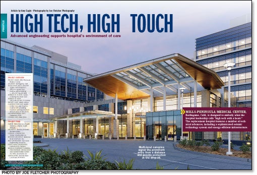
The exterior forms and materials of the medical center were chosen to balance a sense of sophisticated medical care with a community focus at the hospital, says Kevin Day, AIA, LEED AP BD+C, senior associate from the San Francisco office of Stantec (formerly Anshen+Allen). The building is designed to communicate confidence in the care provided at the facility and to convey a warm, friendly welcome.
Modern materials provide the desired image and give the building long-term durability, according to Day. Light-colored precast concrete was treated with several textures, from ribbing to a smooth, sandblasted finish, to give the material interest. The precast relates to honey-colored granite installed at ground level.
An aluminum curtainwall that gives the building a modern expression is softened by the aluminum's champagne color, which changes from silver to medium brown to nearly green depending on the light, says Day. The designers worked to achieve a masonry feel using contemporary materials by placing aluminum plate panels with differing tones adjacent to one another on the exterior of the building. "We didn't want a shiny, monolithic, industrial look. We wanted the metal to shimmer," Day says. The design is meant to be fresh and approachable.
Exposed architectural steel and trellises crafted from extruded aluminum tubes help shade the patient rooms on the top floors of the patient towers and reflect light, providing the building with a radiant glow during the day. The undersides of canopies at the main and emergency department (ED) entrances are highlighted with real wood veneer, which makes the entrances easy to locate and gives them a more hospitable appearance.
Pamela Anderson-Brulé, president and principal of design, Anderson Brulé Architects, San Jose, Calif., says it was noted during a design workshop with hospital staff that the ED is the first experience many patients and families have with the hospital, making it critical that the interiors of the ED lobby and main lobby have a similar feel. Each of these spaces features seating arranged to facilitate family conversations, along with plenty of natural light and views of exterior landscaping.
The medical center cafeteria is located on the main floor of the adjacent medical office building, easily accessible from both the main lobby and ED lobby in the hospital. The cafeteria features a variety of seating options, including outdoor seating. Brighter colors, cushioned seats and hanging light fixtures contribute to a high-end dining experience that attracts not just patients, visitors and staff, but local residents and volunteers. The cafeteria design "speaks to the hospital as a community member," says Susan Porter, senior interior designer, Anderson Brulé Architects.
Aiming for efficiency
In addition to the main lobby and ED, the first floor of the medical center includes preoperative and postoperative services, surgery and radiology. One of the advantages of building a replacement facility from the ground up is the opportunity to "get those adjacencies correct" for operational efficiency, says Kollerer. The medical office building adjoins the hospital on every floor, allowing physicians to move quickly between inpatient and clinical functions.
The hospital's two patient towers are L-shaped, to create a more compact floor plate that minimizes walking distances for nurses on the patient units. The towers are positioned facing away from one another, a design that allows for long-range views from each patient room of the San Francisco Bay; the San Bruno mountains; or the city of Burlingame, which is known as the "city of trees."

The ICU receives natural light from both exterior windows and interior courtyards.
Interior elements
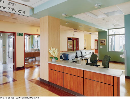
The interior design includes materials and colors representing elements of nature. Wood veneer, wood-look vinyl, stone-look laminates, and carpet and fabric with subtle, natural patterns combine to create a healing environment throughout the building. A calming color palette of blues, greens and teals supports this concept, which provides a unifying theme for the facility.
Realizing that different parts of the hospital, such as the surgery department and the birthing center, evoke different emotions, the interior architects worked with hospital staff to designate "environment zones" within the building. The materials and patterns used in each zone address the specific experiences of patients, visitors and staff in that area, as well as specific maintenance requirements.
The birthing center, for example, features a home-like design with wood-look flooring, a comfortable rocker in each room and glass-tile details in the bathrooms. Softer, more feminine colors and patterns are meant to appeal to female patients. A color change at each patient room doorway aids with wayfinding.
The interior design of the neonatal intensive care unit addresses the joys and concerns of parents whose infants are admitted to this unit. Colorful patterns on the walls and in the flooring favor a nursery atmosphere.
The surgery department is designed to be warm and welcoming, but also to help patients and their families understand that the hospital has the latest technology for patient care. Here the interiors feature a cleaner, crisper design with less hidden medical equipment.
Defining the experience
The service delivery plus the environment defines the experience for patients and their families at the facility, concludes Anderson-Brulé.
Amy Eagle is a freelance writer based in Homewood, Ill., who specializes in health care-related topics. She is a regular contributor to Health Facilities Management.
Sidebar - Seismic system allows hospital to prepare for the big one
Sidebar - Sustainability plays big role in infrastructure systems
Sidebar - Spec sheet


