Sign language
 Because so many emotional milestones or events occur at hospitals, it's comforting to feel confident about directions and navigation. That's why hospital wayfinding design strategies are so important.
Most architects and hospital facility managers agree that important hospital wayfinding elements include exit and entrance signs, directions to different departments, buildings or wings and parking areas. Wayfinding can also be defined from the standpoint of the designer and the client establishing or improving the function of a particular environment.
Strategic discussions should address the real sources of confusion in the hospital environment, which might be operational, organizational, nomenclature or the building itself.
The wayfinding strategy should pay particular attention to those visiting the hospital campus for the first time and those who visit infrequently. The number of repeat visitors, sight and mobility limitations and the emotional state of the user and whether the facility is entirely new or a revision to an earlier facility all must be taken into account when developing a wayfinding plan.
A holistic approach
Many talk about taking a holistic approach to wayfinding. There's a lot that goes into these processes including budget, timeline, relationships with prior designers, aesthetics, compliance issues, the age of the building, the "personality" of the community, the style of the architecture, humor – the list of considerations is almost endless. It takes leadership, patience, a financial background and the ability to respect a number of perspectives to lead a team through a wayfinding strategy process.
 |
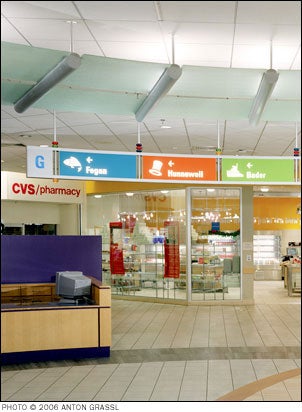
| The letter G at either end of this large overhead sign in the main lobby indicate the ground floor location. Symbols, building names, and arrows in color-coded boxes direct visitors to the actual building locations. |
Involving those knowledgeable and less knowledgeable in initial wayfinding strategy sessions and final discussions is essential. Include impartial parties such as patients and visitors and hospital volunteers. Also include the hospital's director of facilities planning and design, interior designers, architects, engineers, contractors, physicians, clinical staff and administration. This collaborative "think tank" approach works best.
Wayfinding should not be considered a different activity from signage design but, rather, a broader, more inclusive way of assessing all the environmental issues which impact our ability to find our way. The wayfinding strategy for the hospital should be place-based and as intuitive as possible, referring to notable and memorable buildings and landmarks such as interior courtyards. Transitions between various open spaces should be well-articulated. The strategy should also address the movement of vehicles and pedestrians.
Direction-giving by staff and other occupants of the building is an essential part of the user's environmental influences and must be organized and trained whenever possible.
As many hospitals are growing, evolving and adding new buildings and facilities, the numbers and kinds of destinations increases and the sequence of arrival to a central place becomes more complex depending on the visitor's arrival place. Interior pedestrian wayfinding benefits from the same clear articulation of places, buildings and corridors as those on the campus itself.
Corridors should be direct and contain views to both interior and exterior landmarks. Inside, transitions or thresholds between buildings should be articulated. Changes in level and related stairway and elevator locations should be clearly signed and easily located. The idea of a simple sequence and hierarchy of spaces by which the first time visitor would go through the hospital campus is important. Each place in the sequence will contain signage to direct people to the next place within the overall sequence of places until they reach their destination. As the hospital campus grows, wayfinding strategies will continue to evolve.
Developing standards
Develop a set of hospitalwide standards based on surveys conducted with the personnel who work in and around locations where signs are displayed. Surveys should also include patient and visitor review of sign locations and easy to understand messages.
 |
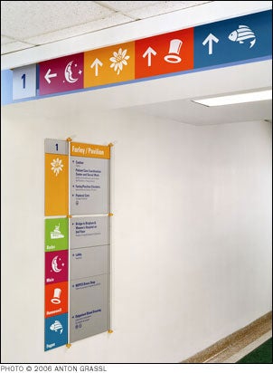
| Overhead signs direct visitors to buildings; wall directionals guide visitors to buildings and major destinations found along the connector. |
Surveys can be as simple as tick sheets for receptionists and information desk attendants to record the most common wayfinding questions. Results can inform naming and circulation strategies. Surveys can record reactions and interest in graphics, photos and drawings to help stakeholders explore and understand the possibilities that wayfinding offer.
For example, question whether kids will respond to animal or nature pictograms in children's hospital environments? Surveys may yield answers to questions about favorite and least favorite areas of the hospital for site navigation.
"Standards must include a hierarchy specifying what merits a sign and what size the sign should be," says Lee Nason, the director of facilities planning, design and construction at the University of Massachusetts at Dartmouth. "Secretaries might or might not get office signs specifying their names and titles, for instance. Informal departmental segments may or may not be given recognition. This decision is largely an economic one which must be decided by the signage manager in order to maintain control over the budget constraint."
All too often staff may not remember the idiosyncrasies of a facility's physical organization, which results in ineffective wayfinding. Wayfinding experts are often at odds with designers and architects about the necessity of certain signage. Some architects believe that the building itself through design elements such as curving hallways will help people find their way. Typically, the wayfinding expert lobbies for bold, colorful signs with sharp contrast between the text or symbol and the background.
"Be careful not to let the hospital occupants have sole control over the process of setting graphic standards. They may choose signs based on personal aesthetics instead of readability. Hospital managers determine where signs are needed and the content of those signs," says Nason. "Because signage needs to change frequently -- relocations, new hires, reorganizations, retirements, vandalism -- a key component of any signage program must be how easily and inexpensively operational changes can be made. As a rule, signs should be replaceable within two days. Signage must be designed to be durable and vandal-resistant and cleanable," Nason says.
 |
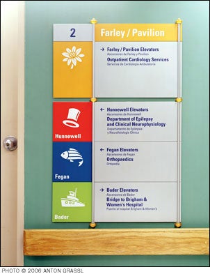
| Throughout the hospital at major intersections and decision points, there are wall-mounted directional signs that list building names, primary and secondary destinations, and public services. |
Surveys should also address the needs of key audiences. For example, aging baby boomers make up a large percentage of those at hospital campuses. As they age, the demands for clearer signs will increase. The naming, numbering and general organization of the parts of a building is a critical, organizational aspect of a wayfinding plan. Floor numbering, dedicatory names vs. common names, departmental names, stall numbering and room numbering must be carefully considered. People using the environment bring with them unique abilities, limitations and memories about navigating which must be accommodated by any overall wayfinding strategy.
Consider the needs of cultural and ethnic minorities, kids and the elderly. All must be able to use the facility with a minimum of assistance.
"ADA compliance must always be adhered to," adds Nason. "This includes entrance directories and a phone number to call for accessibility assistance. If the building is not universally accessible, handicapped routes must be designated."
Naming places that are poorly defined spatially or applying several names to one place should be avoided. When wayfinding strategies work, the results are a clear and concise scheme, capable of presenting complex information in a clear and understandable format. Simplicity of management and ease of change are easier to implement once the strategy has been hammered out.
Once the hospitalwide standards are documented, post them within an arm's reach of sign printing equipment. Share these new sign standards with all employees at meetings. This way, design changes are understood by everyone.
There is a huge convenience factor if a facility chooses to print their own wayfinding signs because the new generation of handheld and desktop industrial labelers are so easy to use. Once the standards have been established – size, font, color, materials -- almost anyone can maintain, update and replace items such as maps, legends and directional markers.
Many institutional printers also feature specially engineered supplies like conformable polypropylene tape that bends and twists for conformability to indoor and outdoor textured surfaces and reflective sign blanks and that provide bright and reflective background on a sturdy aluminum backing.
One of the lessons from the evacuation of the World Trade Center that hospitals can apply involves marking exit stair pathways with glow in the dark signage to help people navigate more smoothly in smoky conditions and when lights fail. In fact, the National Fire Protection Association 101 requires photoluminescent markings to be placed in multiple locations including along walls and doorways.
Cost-effective solution
A clear, organized set of sign elements can be the most cost-effective solution to wayfinding improvements in an existing building. Related graphic devices such as floor marking tape, wall and floor graphics, strategic placement of sculpture, art programs and computerized information kiosks are all potential elements in a successful wayfinding plan.
"Wayfinding should feel good and relaxing," concluded architect Ron Lustig from Earl Swensson Associates, Inc.
Captions and photos are from "The Wayfinding Handbook: Information Design for Public Places by David Gibson (Princeton Architectural Press, 2009)," and used with permission from the author and publisher. Wayfinding and signage design by Two Twelve, New York; and photography ©2006 Anton Grassl.
Steve Stephenson is a managing director at Graphic Products Inc., which has served the signage needs of hospitals and healthcare organizations for more than 40 years. He can be reached at sstephenson@graphicproducts.com.


