A 'Pebble' in Pennsylvania

Project Overview
- Project Name: Paoli Pavilion
- Location: Paoli, Pa.
- Total floor area: 292,000 square feet
- Number of floors: 5 plus a penthouse
- Number of beds: 124 total (16 critical care, 14 progressive care, 32 telemetry, 62 medical-surgical)
- Project cost: $144 million
- Construction cost: $110 million
- Groundbreaking date: March 2007
- Opening date: July 2009
Project Team

View "Paoli Hospital | Paoli, Pa." Gallery
- Owner: Main Line Health
- Architect, Engineer, Interior Designer and Planner: EwingCole/RDLA
- Construction Manager: HSC Builders & Construction Managers
- Medical Equipment Planning: Medequip International
- Civil Engineer: Chester Valley Engineers Inc.
- Landscape Architect: Glackin Thomas Panzak Inc.
For the new patient tower at Paoli (Pa.) Hospital, the project team used evidence-based design strategies to create a unique patient environment.
As a partner in the Center for Health Design's Pebble Project, the hospital considered how every detail of the facility, from the placement of wall outlets to the shape of the patient rooms, would contribute to safety, comfort and efficient care.
Welcoming and convenient
The 292,000-square-foot patient tower, known as the Paoli Pavilion, includes a new lobby, 124 private patient rooms and an emergency department (ED) triple the size of the hospital's previous one.
A small park at the entrance to the pavilion creates a feeling of peace and tranquility. This park was designed in an area that otherwise might have been paved for vehicular drop-off and valet parking lanes. The project team decided to keep the hospital's existing vehicular entrance, which is located nearby, to create a green space between the pavilion and the parking garage.
This design helps to separate vehicular and pedestrian traffic, makes for a more pleasant arrival sequence and was less costly than relocating the existing vehicular drop-off, says Robert M.R. Mainwaring, AIA, ACHA, LEED AP, principal-in-charge, from the Philadelphia office of architecture, engineering, interior design and planning firm EwingCole/RDLA.
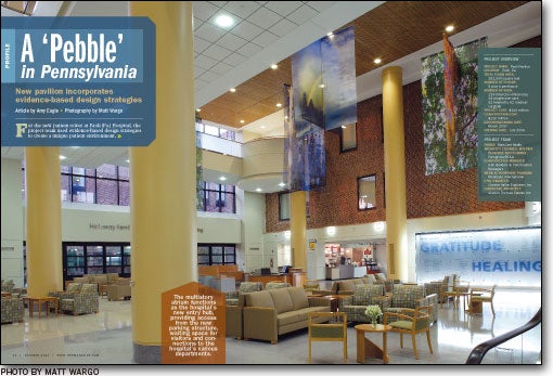
An enclosed pedestrian bridge with windows overlooking the park leads from the second level of the parking garage to the new pavilion's three-and-a-half-story atrium lobby, which connects directly into the existing hospital on multiple levels. A brick wall that was formerly the exterior of the hospital building is featured in the atrium design.
The atrium serves, in part, as a waiting area for the ambulatory surgery department, which is located on the first level. Ambulatory surgery patients can register, wait, undergo surgery, recover and be discharged without transferring to another part of the hospital. "It's very convenient," says Jan Nash, the hospital's vice president of patient care services.
Fast throughput
The new ED is one level down, with an entrance on the other side of the building. Four triage stations are located at the front of the department, with an adjacent six-bed, fast-track unit.
Mainwaring notes a fast-track unit should be able to accommodate about 4,000 patient visits per year per bed, while an acute care ED unit can handle about half that. "So when you separate those, you can increase throughput," he says. He adds with some bemusement that the system the project team developed for Paoli Hospital works so well that the ED's nice, new waiting area often is empty.
Small subwaiting areas throughout the ED allow family members to remain close to patients during diagnosis and treatment. "We like to include the family in what's going on. They can move right along with the patient," says Nash.
The treatment bays are private. A vestibule with a hand-wash sink and computer terminal is situated behind the sliding glass door of each bay, separated from the patient care area by a cubicle curtain. This provides a small work and consultation space for caregivers.
Custom design
The inpatient rooms have an angular shape designed to meet the hospital's specific structural and operational requirements. The rooms are private, same-handed and have outboard toilets located on the headwall, to promote patient privacy and safety (see sidebar on page 19).
The use of outboard toilets gave the designers an opportunity to include a window in the patient bathroom, in addition to a large window in the room itself. "When you open the bathroom door when the light isn't on during the day, it doesn't look like a black hole. It's just a friendlier space," says Mainwaring. Etched glass maintains patient privacy while allowing natural light into the bathroom.
The electrical outlets in patient rooms are installed 30 inches above the floor, instead of the standard 24 inches. The higher outlets are "terrifically helpful for the nurses," who must work with ever-increasing electrical equipment in patient care, says Nash.
Dedicated staff lounges on each unit give caregivers a place to get some mental down time, she adds. Previously, the hospital's staff lounges doubled as education rooms. Now, staff members have a separate space in which to unwind.
The core of the patient unit is designed with slightly angled walls, like those in the patient rooms, to give it a more comfortable atmosphere. "The idea was to make the space feel a little more open and relaxed," says Mainwaring. The corridors angle out to make the primary nurse stations seem more like large rooms than work areas next to rigidly parallel hallways.
The operating rooms (ORs) also took a page from the patient room design. Like the patient rooms, the ORs are same-handed. Nash says physicians and caregivers have indicated "it's comforting to know which way you're going to turn in a heartbeat."
Definite value
From glass walls in the atrium lobby to the nearly 8- by 8-foot windows in the patient rooms, the pavilion is connected strongly to its surrounding gardens and tree-lined, hilltop site.
Nash says that given Pennsylvania's limited number of months each year with nice weather, one might question the outdoor emphasis. She goes on to describe an elderly patient who watched his grandchildren build a snowman in the garden outside his room last December.
"That grandfather was thrilled," she says. "It just made his day. Is it really that valuable? It is."
Amy Eagle is a freelance writer based in Homewood, Ill., who specializes in health care-related topics. She is a regular contributor to Health Facilities Management.
Sidebar - New facility logs impressive patient safety results
Sidebar - Patient room design leads to increased efficiency
Sidebar - SPEC SHEET


