Rural hospital project to upgrade vital functions

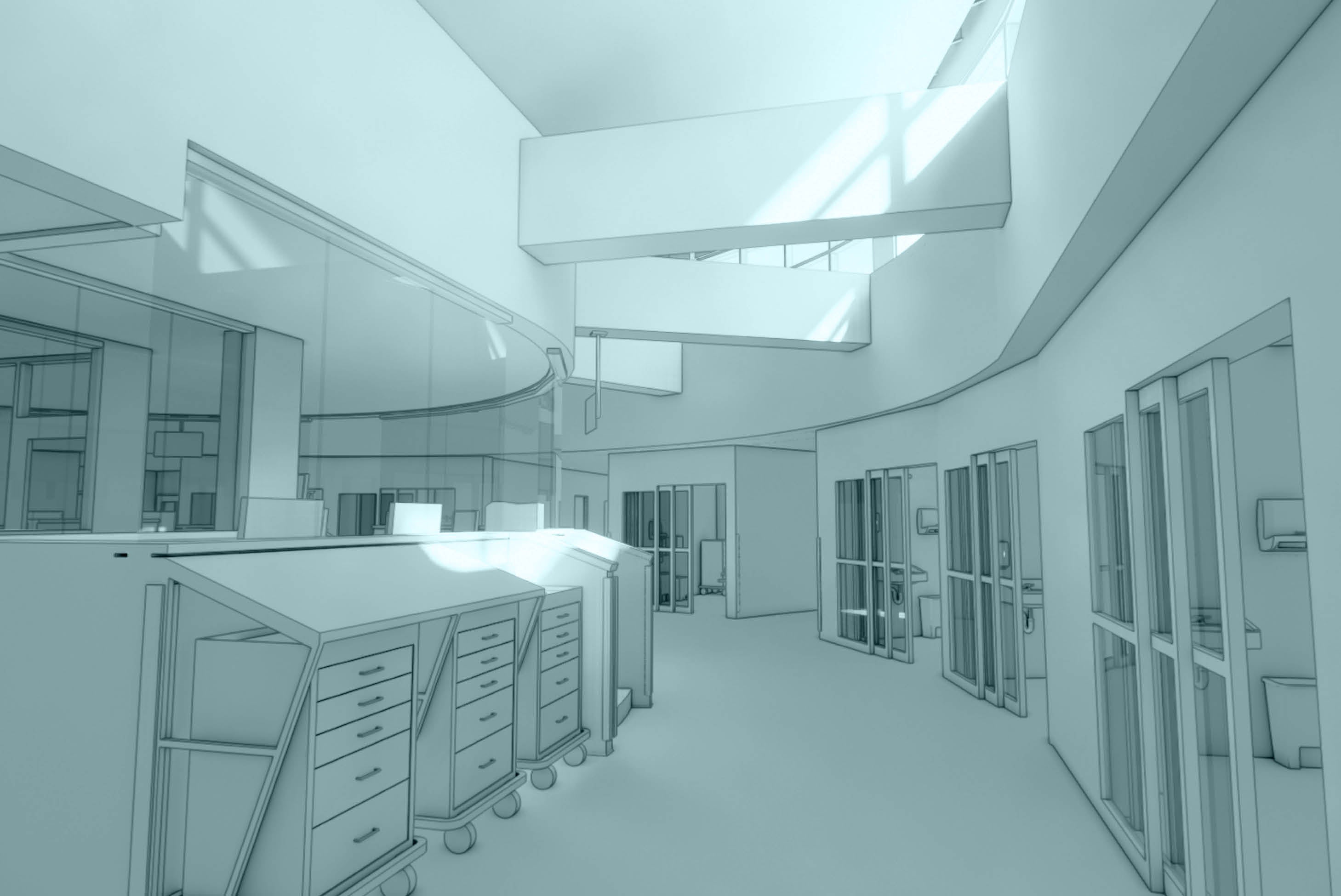
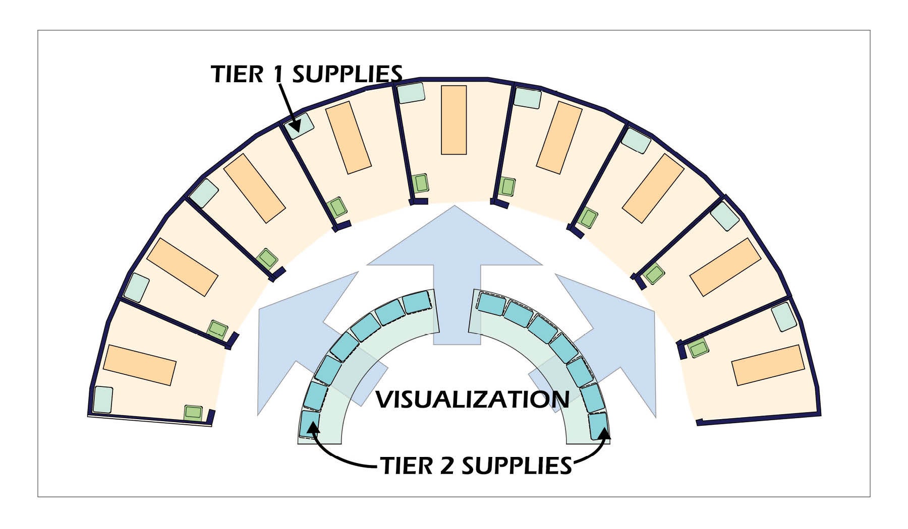
The radial ED maximizes visualization and minimizes travel distance to supplies, with clerestory lighting bringing daylight to the interior spaces.
Image courtesy of the authors
Punxsutawney Area Hospital (PAH) is a 49-bed rural hospital in Pennsylvania’s Jefferson County. It serves a three-county area in the northwestern part of the state. In November 2020, Indiana Regional Medical Center, located 25 miles south, formalized its long-standing collaboration with PAH to operate under one governing board of directors.
Part of the Pennsylvania Mountains Healthcare Alliance, this collaboration sustains the high level of patient care residents receive in both Indiana and Jefferson counties. The knowledge and familiarity with each other’s capabilities and resources has enabled both hospitals to further strengthen their connections, retain their local identities and operate as two separate nonprofit corporations operating two separately licensed community hospitals.
PAH has been named a Top 100 Rural and Community Hospital for a fourth consecutive year by the Chartis Center for Rural Health. Additionally, the National Rural Health Association announced PAH is one of its top 20 highest-ranked rural and community hospitals in the country based on evaluation by the Chartis Center.
To help maintain this leading role, a project team has planned an upgrade of three of its key departments.
Existing conditions
PAH’s emergency, imaging and lab departments have not been upgraded since the opening of the existing facility in 1977, which replaced a hospital built in 1898. Significant renovation is required to bring these areas up to the standards, technology and quality of patient care concurrent with the advancements in medical care.
The emergency department (ED) became the central focus for upgrading care. Subsequently, imaging and lab services expanded to support the advanced operations and technology of the new ED.
The ED originally had seven open-bay treatment spaces and two private rooms. With the advent of the COVID-19 pandemic, the physician on-call room was converted to an exam room resulting in a total of 10 treatment spaces. As standards for emergency care have significantly changed since then, the space is now clearly substandard.
An evaluation of the space found the following:
- Three of the 78-square-foot treatment spaces are too small for appropriate care and the open bays afford no privacy. Opportunities for family bedside presence is severely limited.
- Two spaces earmarked for trauma at 130 square feet are inadequate for this level of care.
- Two spaces designated as orthopedic are 140 square feet, which is an appropriate size, but the open bays afford no privacy. Additionally, one of these spaces has limited visibility from the team center.
- The two private rooms and the converted on-call room are approximately 130 square feet — an appropriate size. However, these rooms are around a corner and not in sight of the team center.
- The 115-square-foot team center is sorely overcrowded with computer stations, printers, equipment and staff. Spaces for supplies and medications have been overwhelmed, resulting in equipment being stored in the circulation space throughout the unit.
- The ED total area is 3,592 square feet, or 359 square feet per treatment area, while current standards call for more than 800 square feet per treatment area in small EDs.
- A further impediment for efficient operation lies with the ambulatory (walk-in) patient entrance. This entrance and waiting area is shared with outpatient services, commingling differing patient types. There are separate registration spaces for the ED and outpatient services on either side of the entry. However, the configuration of the space is too small, and patients can get confused regarding which way to go. Queueing becomes congested and confusing much of the time.
- The ambulance entrance adjacent to the ambulatory and outpatient entrance is configured so that ambulances must back in. Such maneuvering can cost precious time in critical cases. Furthermore, the proximity of the ambulances and ambulatory entrances can create confusion, particularly to walk-in patients deciding which one to use.
- Radiology is not adjacent to the ED. In fact, access to imaging services is awkward and intermixed with public corridors.
- Due to the conversion of the on-call room into a treatment room, there are only two restrooms for the entire unit. Accommodation for Americans with Disabilities Act requirements are nonexistent.
All in all, the configuration and conditions of the current ED are not conducive to efficacious care.
Design solutions
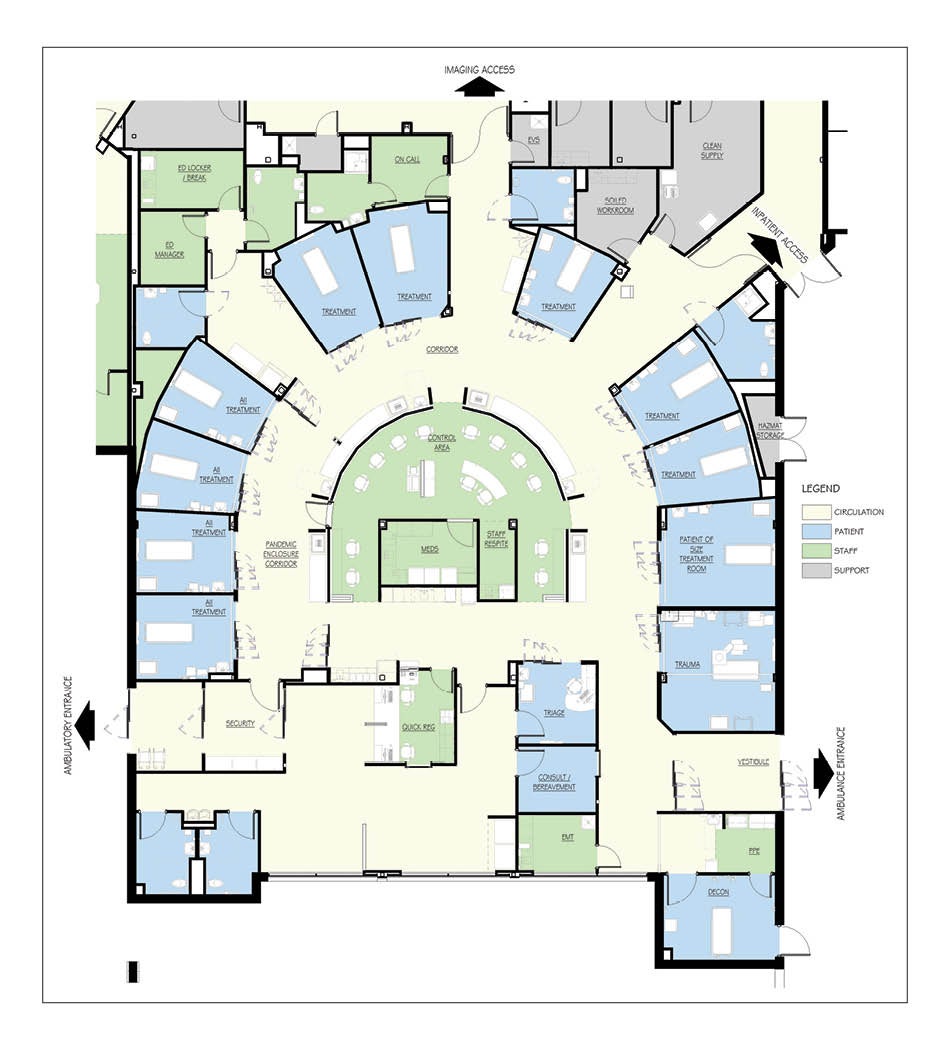
The solution for the ED upgrade is to replace the entire ED with new construction. The data supplied by the hospital listed an annual volume of 14,000 visits to the ED. Using a space planner toolkit, the design team determined 11 treatment spaces will satisfy the demand. These include one 261-square-foot trauma room, one 221-square-foot bariatric room, seven exam/treatment (ET) rooms of about 140 square feet, and two 153-square-foot behavioral health rooms that can be used as general-purpose ET rooms.
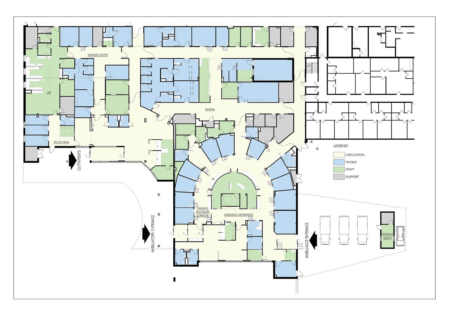
The new ED will occupy 9,113 square feet in a new building addition. The design of the unit is based on a radial ED design concept. The basic drivers of this concept include the following:
Patient safety. When ED physicians and nurses are asked to name the most important aspect of the environment in which they work, the answer is safety. They desire a space that permits them to ensure safe care for their patients. To most ED providers, this means they want to be able to always see their patients. In fact, the preferred arrangement is to have patients arrayed in circular — or radial — fashion with the care team at the center.
Lean operation. It has been well documented that reducing walking distances for nurses improves patient care. In the ED, quick access to supplies is often essential. This is best accomplished by decentralizing supplies so that no more than a few steps are necessary to retrieve material not kept at the bedside.
Economical staffing. ED design is driven by looking at the maximum volume to be expected. However, for a significant part of each day, the number of patients presenting are but a fraction of the peak. During these periods — generally between 11 p.m. and 8 a.m. — staffing is at a minimum. This solution allows the minimal staff to be able to provide safe care for all when unpredictable spikes in volume occur during this period.
Flexibility. EDs are planned based on predicted peak volumes. There are, however, times when those peaks are exceeded due to unusual circumstances. The optimal design supports these surges with minimum disarray and confusion.
Although the ED will be relatively small, the precepts of the radial ED are still valid. The ET rooms are arrayed around the team center to provide maximum visualization of patients by staff. The side of the ET rooms facing the team center will have glass breakaway intensive care unit-type doors. The wall around the ET rooms will extend to the roof deck to maximize sound isolation.
The team center is the home base for all staff. The floor will be a 12-inch elevated platform to enhance visibility of the patients. Supply carts will be arrayed around the perimeter of the team center. Supplies will be replicated so that the distance from any necessary items are not more than 25 feet. A sloping countertop will cover the carts to provide a clean and organized appearance. This is important to minimize stress levels.
A worktop will follow the perimeter on the staff side of the perimeter wall. This wall will cap at 40 inches above the platform. From this point, glass panels will be placed to the soffit. These will be supported only at the top and bottom without vertical mullions, thereby affording maximum visibility.
While there will be a staff lounge, a staff respite area is also located on the platform. This will allow staff to get a quick break without leaving the unit. The medicine preparation room is also on the platform and will be centrally located. These rooms are enclosed in glass to maintain maximum visibility.
The roof above the team center is raised to permit the construction of continuous clerestory light following the perimeter of the “ribbon.” Research shows that allowing natural light into the interior of the space helps reduce stress among staff and patients.
The design promotes a three-tiered supply system:
- Tier 1 is storage of supplies within each ET space.
- Tier 2 is items in the carts arrayed around the ribbon. The use of carts for these supplies affords great flexibility. The carts can be wheeled near the patient, and they can be easily stocked or exchanged.
- Tier 3 is a room on the edge of the unit that is stocked by the materials management department with replenishments for Tiers 1 and 2. The room will have double-sided access so restocking can take place without entering the ED proper. This room will also hold infrequently used items.
The new imaging department is immediately adjacent to the ED and access to the computed tomography (CT) area opens directly across a corridor from the ED. There are two other corridors off the main ribbon arc. These contain parking areas for equipment, linen and crash carts, all within a short distance from the ET rooms.
The footprint of the ED is arranged so that the ambulatory entrance faces the drive approach onto the site, a clear statement as to its purpose. This is a new entrance from the site and will be shared with a new outpatient services entrance and patient parking.
The ambulance entrance, located on the opposite side of the building, has space for three vehicles under a protective canopy. The soffit of the canopy is 14 feet above the pavement — the same as interstate highway overpasses — allowing clearance for any size vehicle. The end of the canopy is supported on a small structure that houses equipment to manage mass or toxic casualty episodes and will also double as a drive-up COVID-19 testing booth for staff. A full-service outpatient laboratory will occupy the space vacated by the old ED. A new lobby will be designed to serve the lab, imaging and a new women’s center. This design will result in a better connection from the ED to CT and X-ray.
Continuing the tradition
PAH has a 130-year tradition of meeting the needs of the people in Punxsutawney and surrounding communities.
And, with the planned upgrade of its emergency, imaging and lab departments, it will continue to improve services, recruit skilled physicians, update technology and focus on providing the best care possible to people in its tricounty area.
Pandemic spurs new design ideas for planned Pennsylvania hospital
The methods Punxsutawney Area Hospital (PAH) staff implemented in the existing emergency department (ED) in response to the COVID-19 pandemic worked so well that they were incorporated into the new design project.
A zone is created to isolate four of the treatment rooms from the main ED by two sets of cross-corridor glass breakaway doors. One set is located at the north end of Room 8. The other is at the end of the “ribbon” opposite Room 11.
These doors are normally open and stacked to the side allowing full corridor width. When providing care during a pandemic they will be closed. At the southernmost doorway will be the personal protective equipment (PPE) station. The northernmost doorway will be used for exiting the zone and doffing the PPE.
The HVAC system for this area — four rooms, the corridor and the section of the ribbon serving them — will have negative pressure. The ambulatory entrance vestibule is designed with a separate door leading directly into this pandemic isolation zone, bypassing the normal route to registration.
About this article
This feature is one of a series of articles published by Health Facilities Management in partnership with the American College of Healthcare Architects.
Joel P. Trexler, ACHA, AIA, is principal/owner at JPT Architects, Johnstown, Pa.; and James Harrell, FAIA, FACHA Emeritus, is consultant at Harrell Consulting, Indianapolis.


