A hospital reborn

Project Overview
- Project Name: Woman's Hospital
- Location: Baton Rouge, La.
- Project size: Five-floor, 497,000-square-foot hospital; two-floor, 69,000-square-foot support services building; and two-floor, 23,500-square-foot central energy plant
- Number of beds: 168 adult beds and 72 neonatal intensive care beds
- Project cost: $285 million
- Construction cost: $233 million
- Groundbreaking date: June 2008
- Opening date: August 2012
Project Team

View "Womens Hospital | Baton Rouge, La." Gallery
- Owner: Woman's Hospital
- Architect, structural engineer, medical equipment planner and furniture specifier: HKS Inc.
- General contractor: JE Dunn Construction Group Inc., Milton J. Womack Inc. and Arkel
- Civil Engineering: ABMB Engineers Inc. (now Stantec)
- Interior Architecture: Ford | Dickinson AAC and Commercial Design Interiors
- MEP Engineering: ccrd partners (design and production) and Assaf, Simoneaux, Tauzin & Associates Inc. (design)
- Landscaping: Dana Brown & Associates Inc. and Talley Associates
Having delivered more than 297,000 babies since it opened in 1968, it's no wonder that Woman's Hospital in Baton Rouge, La., calls itself "the birthplace of Baton Rouge." Now, with the construction of a replacement facility, Woman's Hospital is experiencing a new beginning of its own.
According to Teri Fontenot, FACHE, president and chief executive of Woman's Hospital and chair of the American Hospital Association's board of trustees, the hospital no longer could expand on its original 24-acre site and past expansions had left the building with inconvenient, insufficient parking; departmental adjacencies that did not work well for patients and caregivers; and no room for ancillary departments to grow. The facility could not support the latest clinical technology or care models, and new physicians who wanted to practice at the hospital's medical office building could not, due to lack of space.
"We felt that starting over on a greenfield site would allow us to do all the things that we need to do, plus it would help position us for growth in the future," says Fontenot.
Retreat-like setting
The new 225-acre site, formerly a golf course, provides the retreat-like setting the hospital wanted for patients. With only 85 acres in use, the medical campus leaves plenty of room to grow.
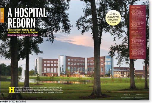
The building is oriented toward a lake, which provides a scenic backdrop for the hospital dining area and all four patient towers. Parking areas are arrayed around the front of the hospital and adjacent medical office building, with multiple entrances for the convenience of patients, visitors and staff.
The facility design translates the ideas of traditional Louisiana architecture into a form that is suited to a large modern hospital. Metal columns and trellises at the entrance "represent the welcoming front porch of the Southern tradition," says Jeffrey C. Stouffer, AIA, principal and senior vice president, academic and pediatric practice leader, HKS. The columns are also reminiscent of piers used to elevate older Southern buildings to improve airflow, adds Jack Ford, AIA, IDSA, vice president, HKS. Curtainwall, used most prominently in curved panels at the ends of the patient units, gives the building an open form in keeping with traditional Louisiana design vernacular. The curtainwall and metal design elements provide a contemporary edge to the custom blend red brick also featured on the exterior.
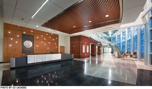
Interior materials include wood, wood-look laminate, stone with a pattern of ocean blues and grays, cloud-colored onyx and earth-toned granite. These warm, natural materials are juxtaposed with metal column covers and contemporary lighting to intensify the characteristics of each. Straight lines and curves, representing masculine and feminine principles, are similarly juxtaposed throughout the building, in paneling, flooring and the overall shape of the hospital. "That motif is basically woven throughout the design," says Ford.
Curved interior spaces are meant to give the design movement for more intuitive wayfinding and to create a more comfortable spatial experience. Details like dots of light behind the lobby reception desk or a band of color that runs like a river through the carpeting of patient units, provide what Ford calls, "the surprise of joy."

Staff-led design
Staff nurses were given the lead in designing patient rooms. "The first exercise we did was a series of mock-up workshops that centered around the different types of patient rooms. And [the architects] were not allowed to participate. We had to watch and document," says Stouffer. Staff members used movable walls and duct tape to define the perimeter and layout of a universally sized room, considering foremost the clinical and family processes that need to take place in each room. As they worked, architects digitally recorded and refined the design to give everyone an idea of how the rooms might be arranged in units.
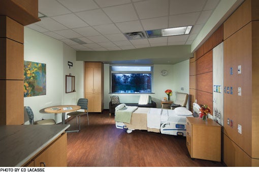
The resulting 400-square-foot private rooms are trapezoidal in shape, with inboard toilets built along the patient headwall to reduce falls; large windows toward which patient beds are angled; and distinct family space. The rooms are laid out in triangular, 12-bed units designed for patient visibility, staff efficiency, central storage and views of the lake and outdoor spaces.
Fontenot says lighting controls and reduced noise in the private neonatal intensive care rooms have resulted in calmer babies, and the increased privacy is helping families to bond and encouraging mothers to breastfeed.
The four patient towers, which eventually may be joined by a fifth master-planned unit not yet built, form a unique design in the shape of a starfish. A rectilinear diagnostic and treatment block is integrated into the ends of the triangular units. This design reduces the travel distances between patient beds and diagnostic and treatment spaces and will be efficient to expand, says Stouffer.
Support services and the central utility plant are located in adjacent structures that were built separately, to take advantage of efficiencies from different occupancy types, exterior materials and finishes.

'Very highly received'
Fontenot says the collaborative design approach, while time-consuming, has paid off in the end with a building that is "very functional for us." She says community members feel close to the institution, through their familiarity with its childbirth, cancer care and general medical-surgical services. "The community is very excited about the new facility. It's so striking and beautiful. It's been very highly received," she says.
Amy Eagle is a freelance writer based in Homewood, Ill., and a regular contributor to Health Facilities Management.
Sidebar - Disaster planning pays off for new health care facility
Sidebar - Compassionate design meets patient needs
Sidebar - SPEC SHEET


