Family focused

Project Overview
- Project Name: Children's of Alabama Benjamin Russell Hospital for Children
- Location: Birmingham, Ala.
- Number of floors: 12
- Number of beds: 356
- Project cost: $399 million
- Construction cost: $319 million
- Groundbreaking date: May 2009
- Opening date: August 2012
Project team
- Owner: Children's of Alabama Benjamin Russell Hospital for Children
- Architect: HKS Inc., in association with Giattina Aycock Architecture Studio
- General Contractor: Hoar Construction, in partnership with KBR (formerly BE&K Inc.)
- Project Manager: KLMK Group Inc.
- Interior designer, structural engineer and furniture specifier/coordinator: HKS
- MEP engineer: ccrd
- Civil engineer: Walter Schoel Engineering Co.
- IT and telecommunications: EDI Ltd.
- Landscaping: Macknally Land Design
- Art consultant: Hatcher Design Associates
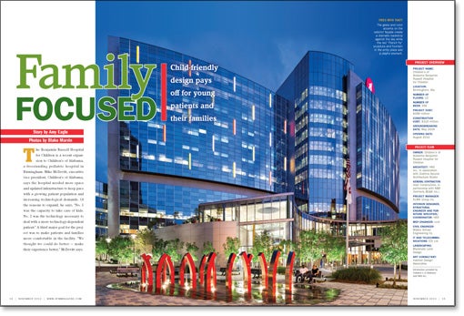
The Benjamin Russell Hospital for Children is a recent expansion to Children's of Alabama, a freestanding pediatric hospital in Birmingham. Mike McDevitt, executive vice president, Children's of Alabama, says the hospital needed more space and updated infrastructure to keep pace with a growing patient population and increasing technological demands. Of the reasons to expand, he says, "No. 1 was the capacity to take care of kids. No. 2 was the technology necessary to deal with a more technology-dependent patient." A third major goal for the project was to make patients and families more comfortable in the facility. "We thought we could do better — make their experience better," McDevitt says.
Form and materials
The hospital is located adjacent to the campus of the University of Alabama at Birmingham. To give the building its own identity, the exterior of the 12-story expansion is primarily glass, a material that sets the new towers apart from the red brick and precast concrete used predominately on nearby university structures. The facade of the new facility is interspersed by colored panels, to give the hospital a cheerful aspect and make it easily identifiable on the Birmingham skyline.
To light the panels at night, architectural fins that conceal light-emitting diodes (LEDs) were incorporated into the face of the building. Placing the LEDs on the outside of the structure is beneficial from a waterproofing perspective and allows maintenance staff to service the lighting system without entering a patient room, says Doug Compton, AIA, LEED AP, principal with Dallas-based architecture firm HKS.
The form of the hospital is based on its operational needs. The project team determined that two patient units per floor with shared support space provided maximum efficiency for staffing. "So, basically, there are two rectilinear units," Compton says. "But there's a slight curve to soften them up a little."
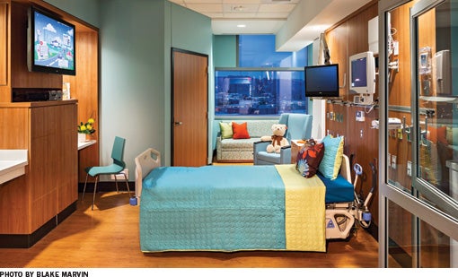
All patient rooms face north toward downtown Birmingham or south toward Red Mountain, a local scenic landmark. Besides providing views, this building orientation avoids the glare and heat gain that can occur with an eastern or western exposure. Energy conservation was heavily considered in the design of the project, which was awarded a Gold rating for Leadership in Energy and Environmental Design (LEED) from the U.S. Green Building Council.

Bright and fun
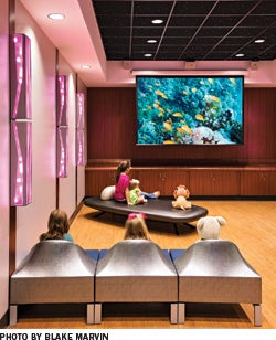
Patients and visitors enter the building through a motor lobby on the first floor, which features a large, colorful blown glass artwork that can be seen through the exterior glass and is intended to give the entrance a strong street presence. Glass elevators and a spiral staircase lead to the main lobby on the second floor. These elements serve a functional purpose and express one design philosophy of the building, which was to provide positive distractions wherever possible. The notion behind the staircase was to "get from Point A to Point B, but have some fun with it," says Compton.
The main lobby "has a clean, fun look that is bright and cheerful," he says. "There's nothing institutional about it." The exterior glass fills the space with natural light, which is reflected, along with the colors of the lobby, in terrazzo flooring with a high-sheen finish. "The floor was polished with an 800-grit diamond polisher instead of the standard 100-grit; the higher you polish a terrazzo like that, the more slip-resistant it is," says Iris Dates, IIDA, LEED AP, EDAC, vice president, HKS. "[The high gloss] made the floor even safer for people to walk on."
A flooring pattern reminiscent of a river leads people along what the hospital calls the "patient journey," past major building destinations like registration. A red circle, taken from the Children's logo, is incorporated into the flooring pattern at points where people can get help, like reception desks and nurse stations. This logo is also used as a graphic device on the upper floors of the building exterior, to reinforce the hospital brand.
Distinctive designs
Patient services are organized in two towers: the Harbert Tower and the Quarterback Club Tower. Each tower has a unique interior design theme, to help visitors distinguish one from the other and easily identify where they are in the facility. Each floor of the Harbert Tower has a wildlife motif, while each floor of the Quarterback Club Tower relates to a sport. The themes are expressed by large wall graphics, including distinctive images at the entrance to each patient room. "Each floor is a unique color. Each tower has a unique theme. Each patient room has a unique image," says McDevitt. "We did a lot to try to address the logic around wayfinding, because we know that is a stressor for families."
The design is meant to appeal to everyone from two-year-old girls to 18-year-old boys, says Dates. "You have to make sure both of them are happy in the facility and not embarrassed to be there." In designing a children's hospital, "we always say we want to make it childlike, but not childish," she says.

The patient units include a number of amenities, like laundry facilities and overnight accommodations, to help family members stay close to their hospitalized children and participate in their care [see sidebar, Page 18].
Patient and family
McDevitt says the first priority of the facility is to ensure that it is supporting the care and treatment of patients. But beyond that, he says, "it's about the experience [families] are having." He says that while people often cannot understand everything being done to address their child's health, "they sure can tell when they're in a facility that's been sensitive to their needs."
Amy Eagle is a freelance writer based in Homewood, Ill., who specializes in health care-related topics. She is a regular contributor to Health Facilities Management.
Sidebar - Hospital designed to strengthen family bonds
Sidebar - Design makes most of teaching opportunities
Sidebar - SPEC SHEET


